

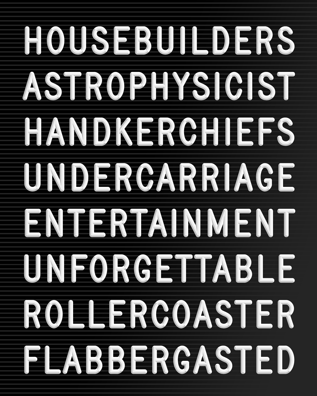
Condensed, with Ruggero Magrì
Mono, with Ruggero Magrì


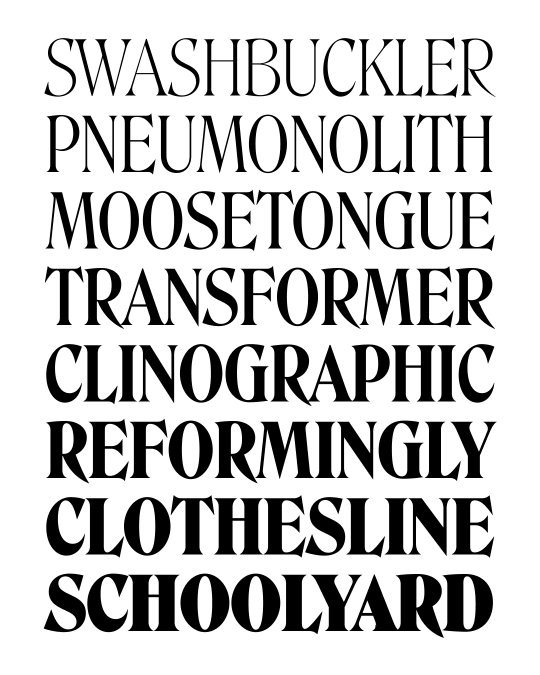


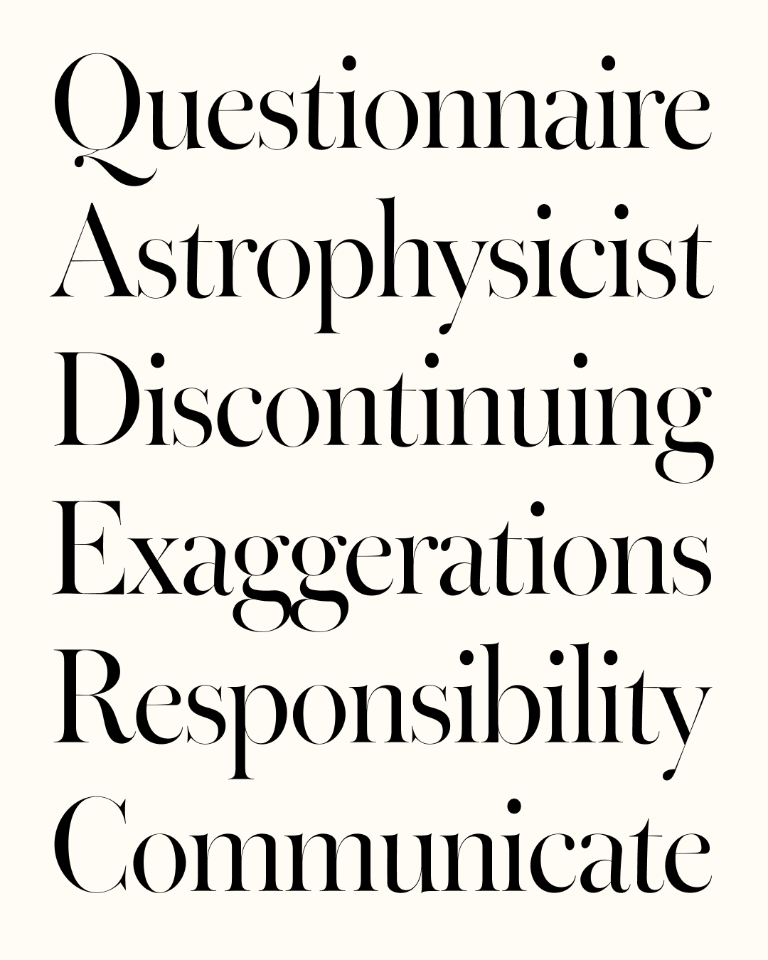
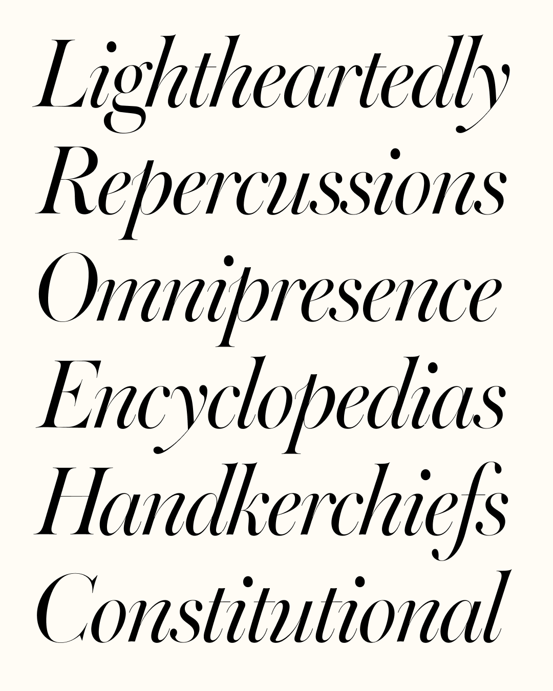
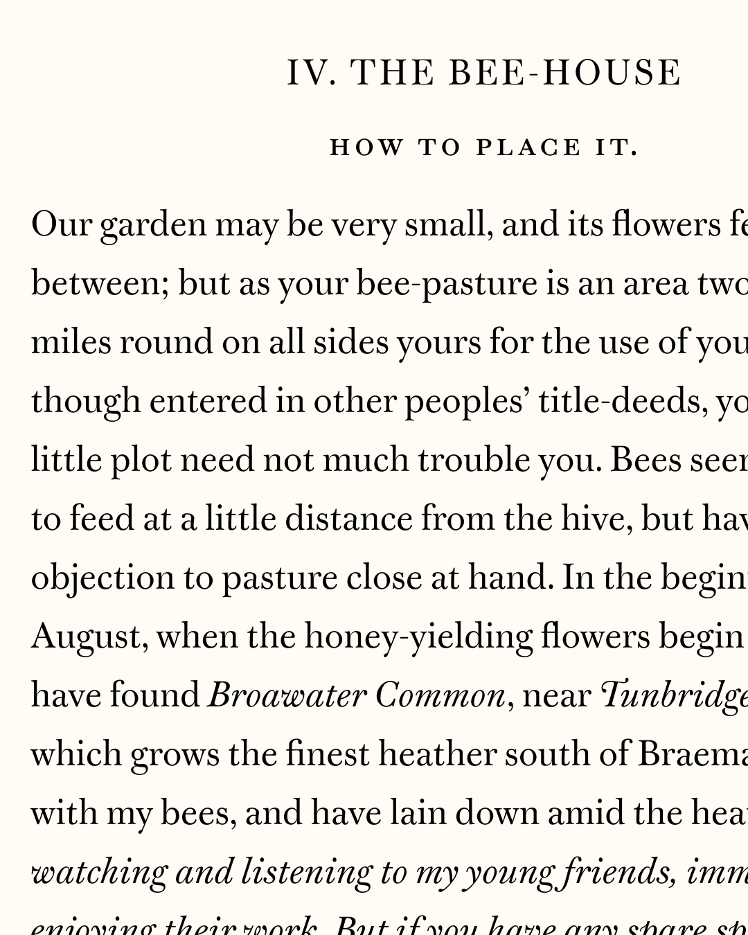
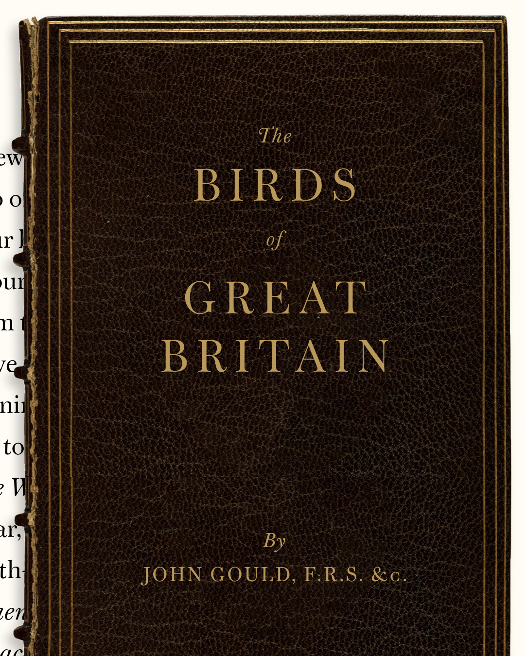
Buckridge
Bungee Widths
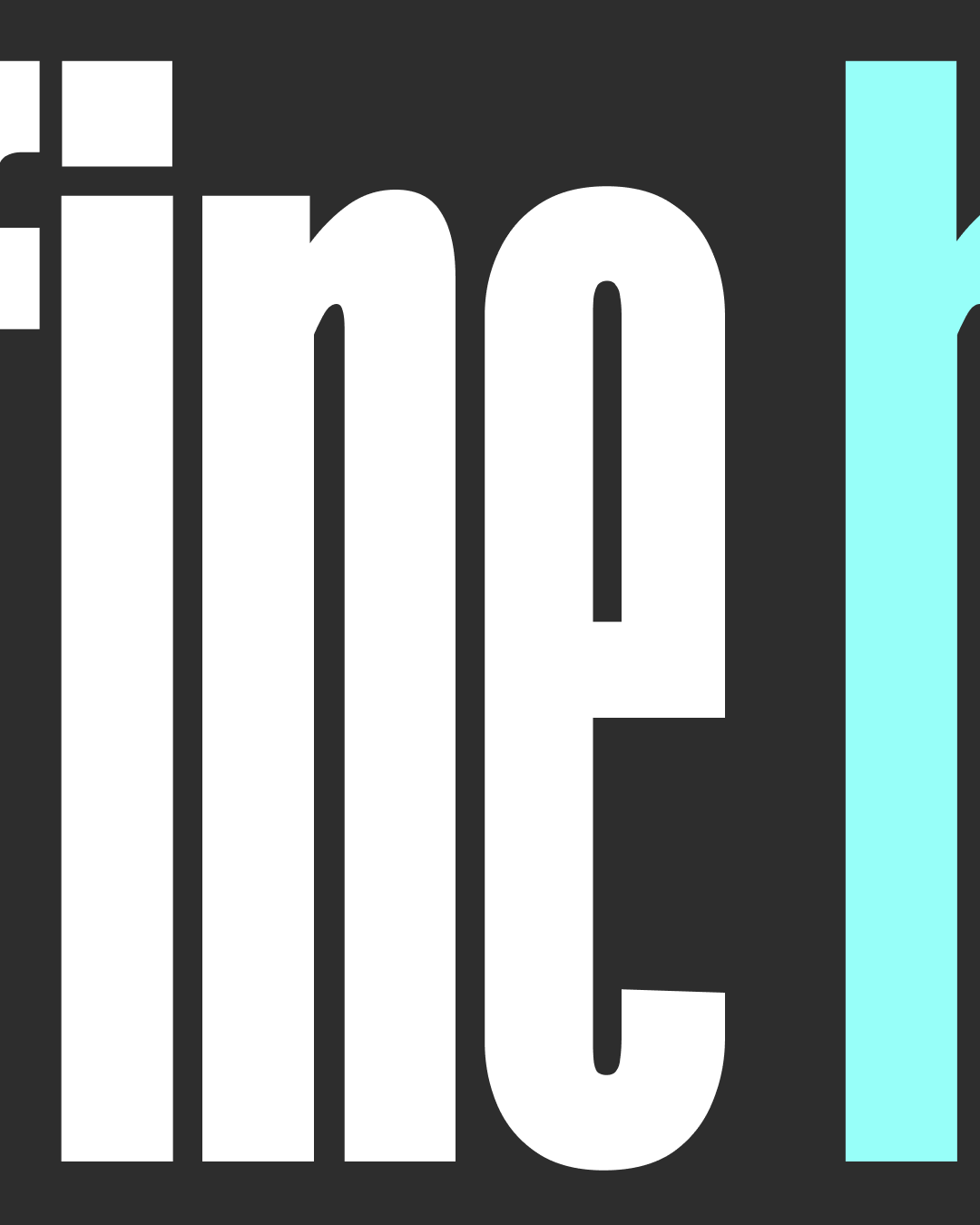
Bradley DJR Outline
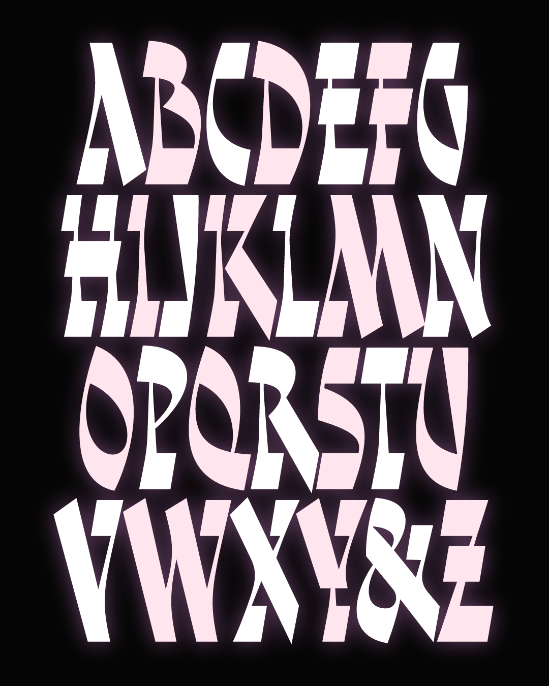
Kuhlman
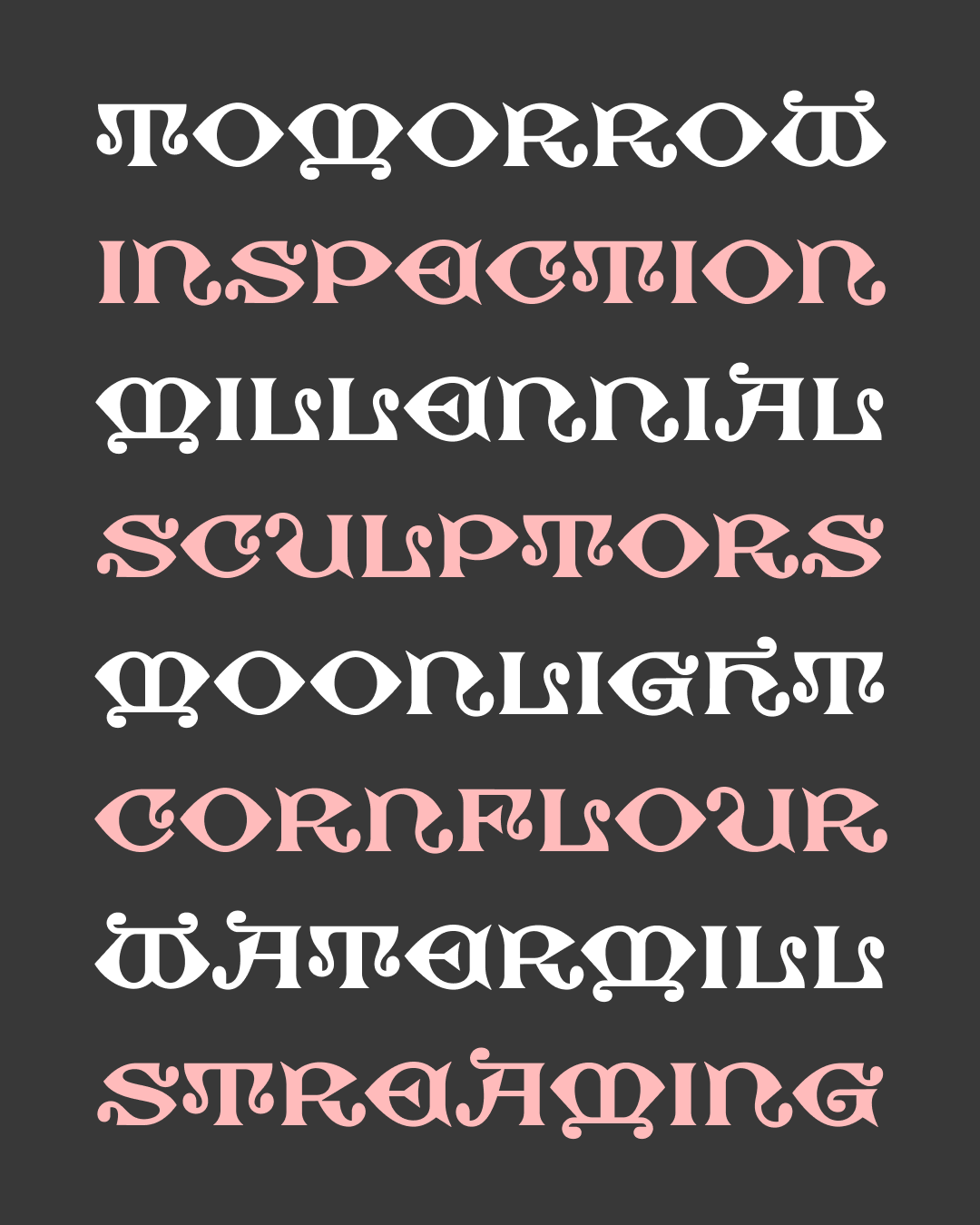
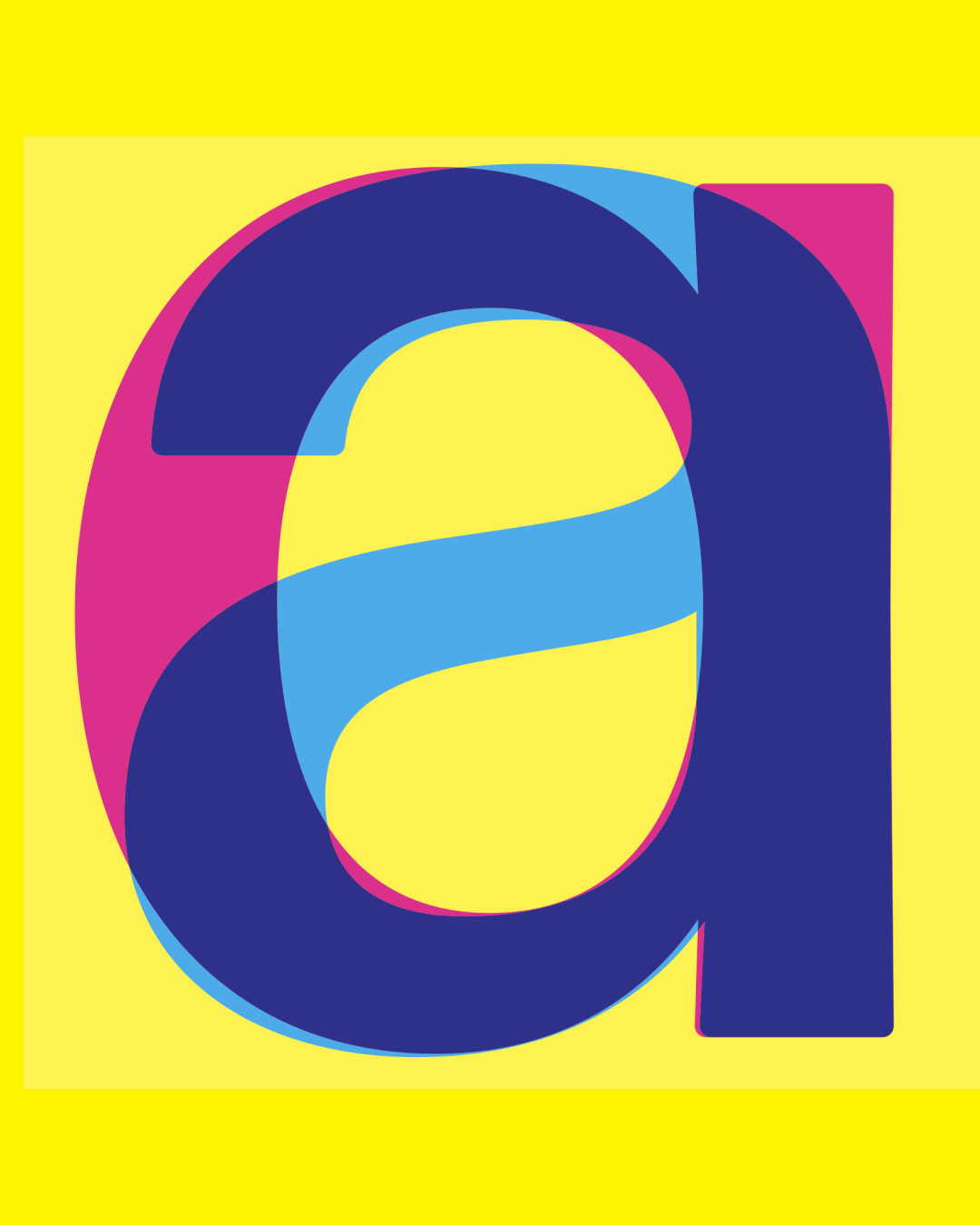
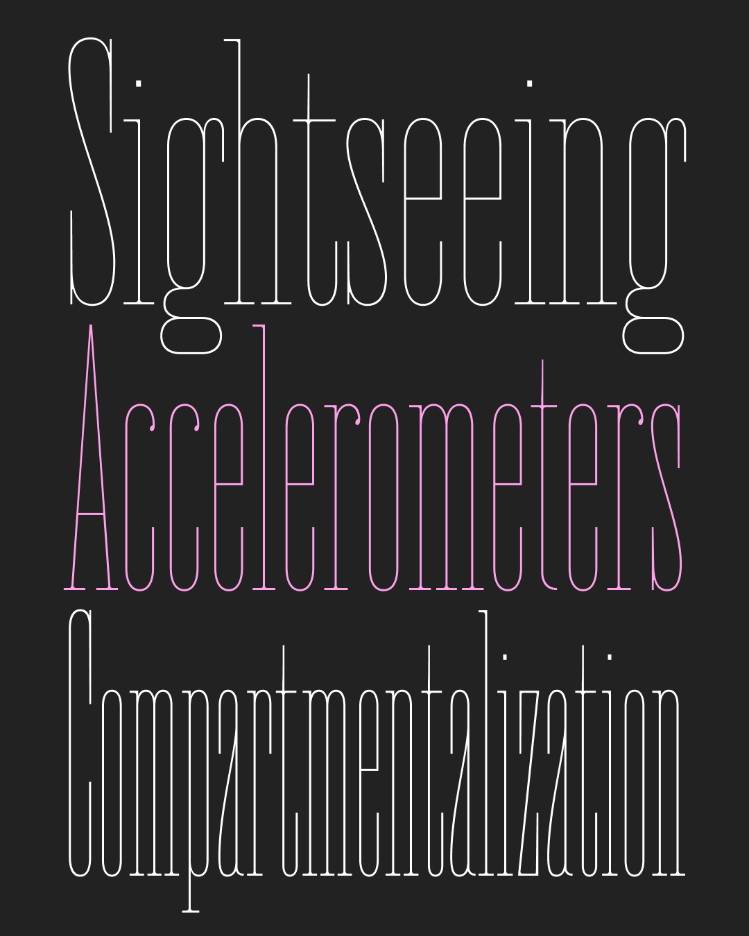
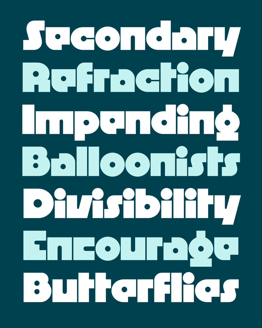
Lentiform

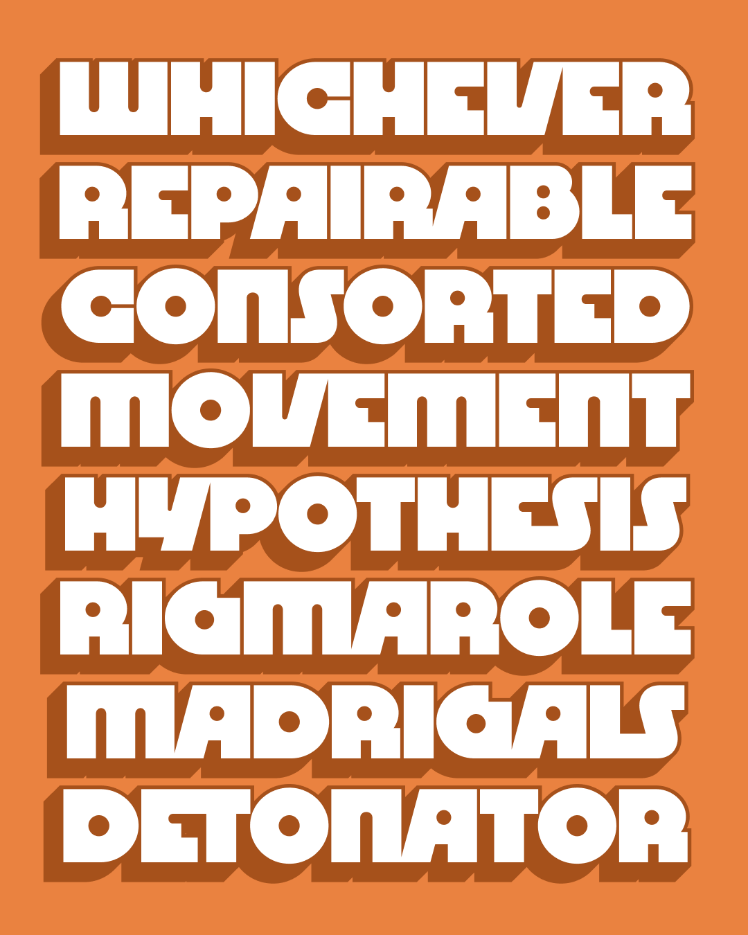
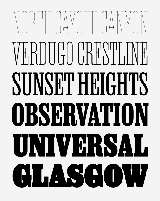
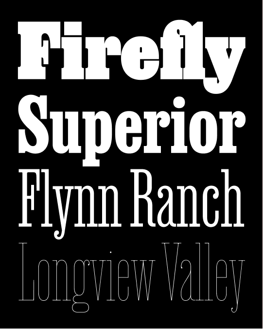
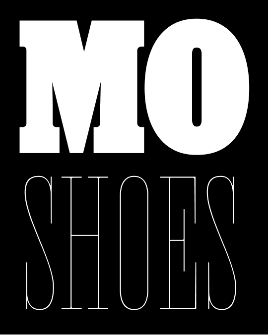
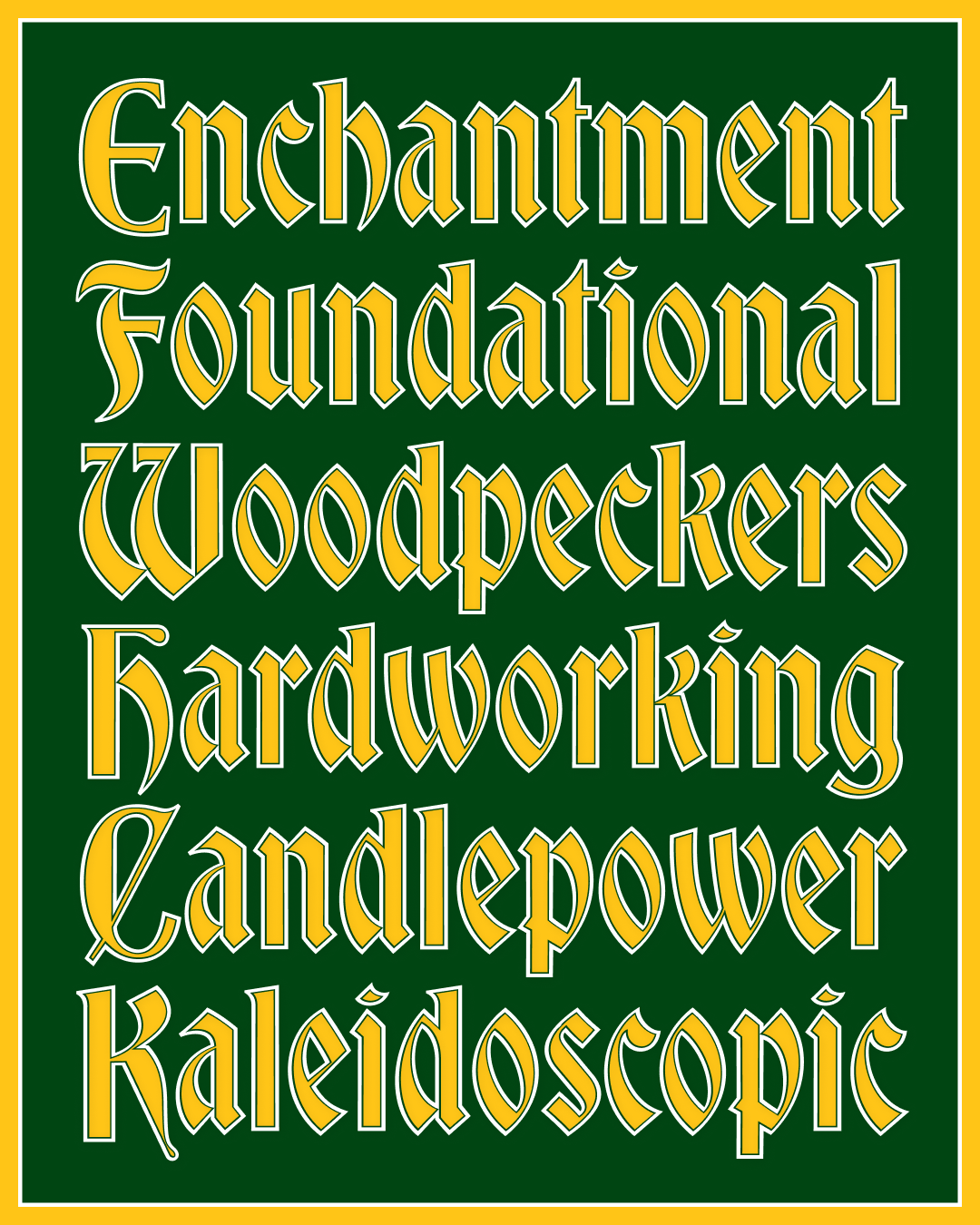
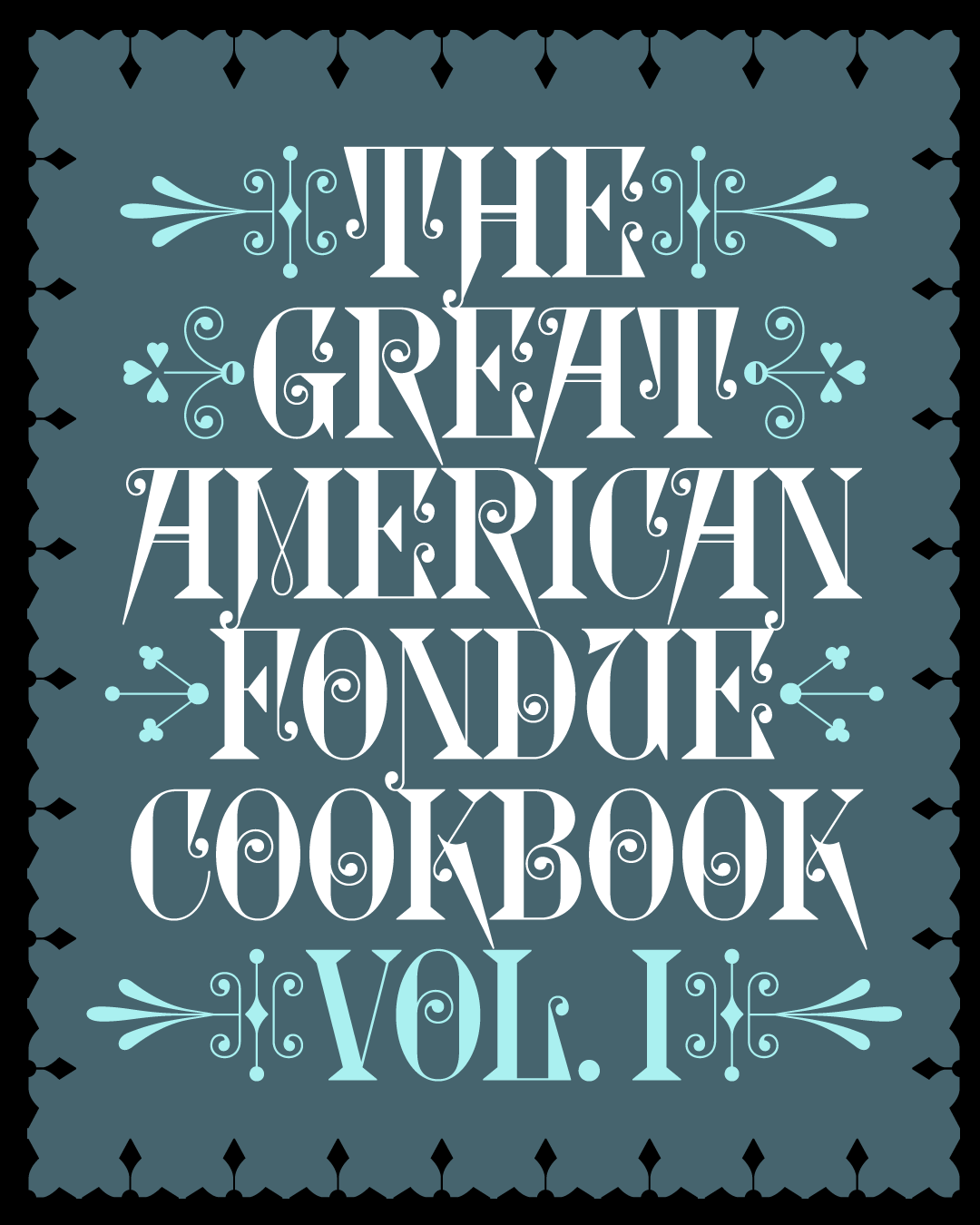
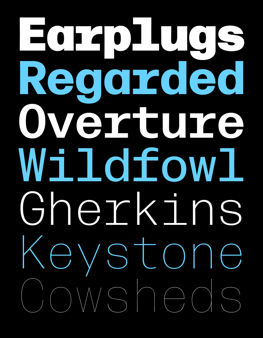
Job French Clarendon
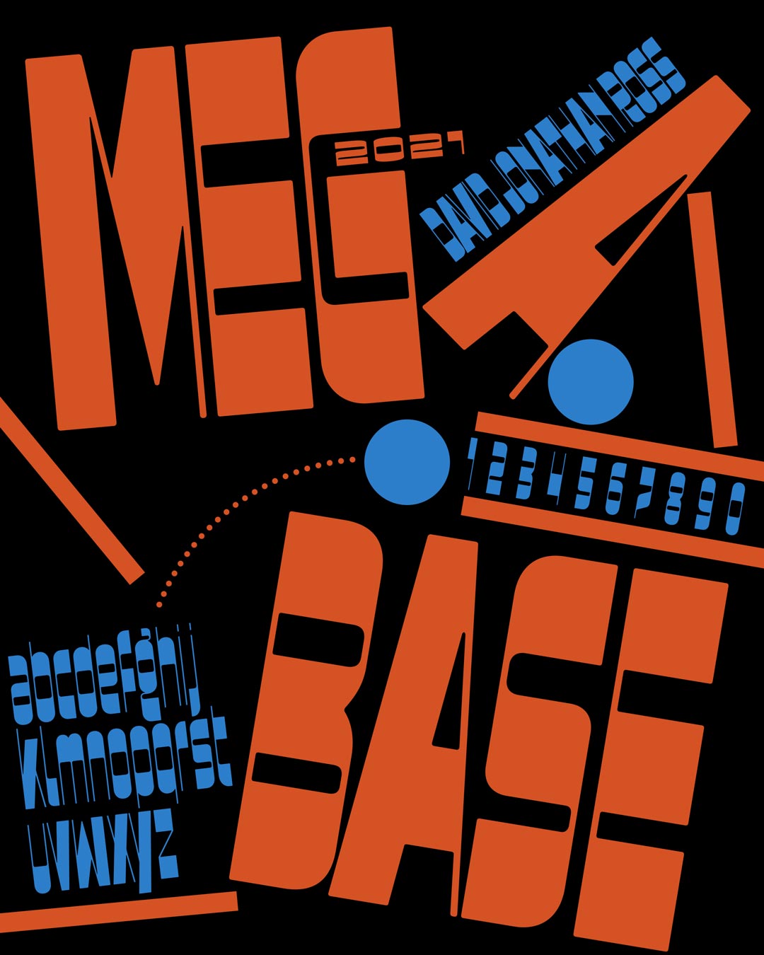
Megabase v3
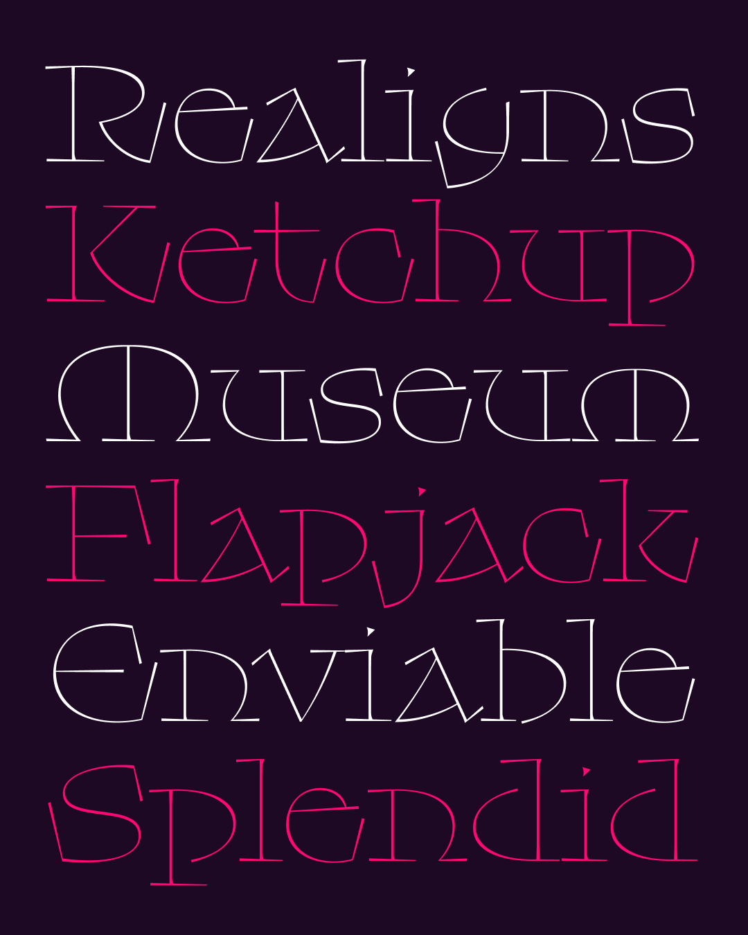
Ottavio
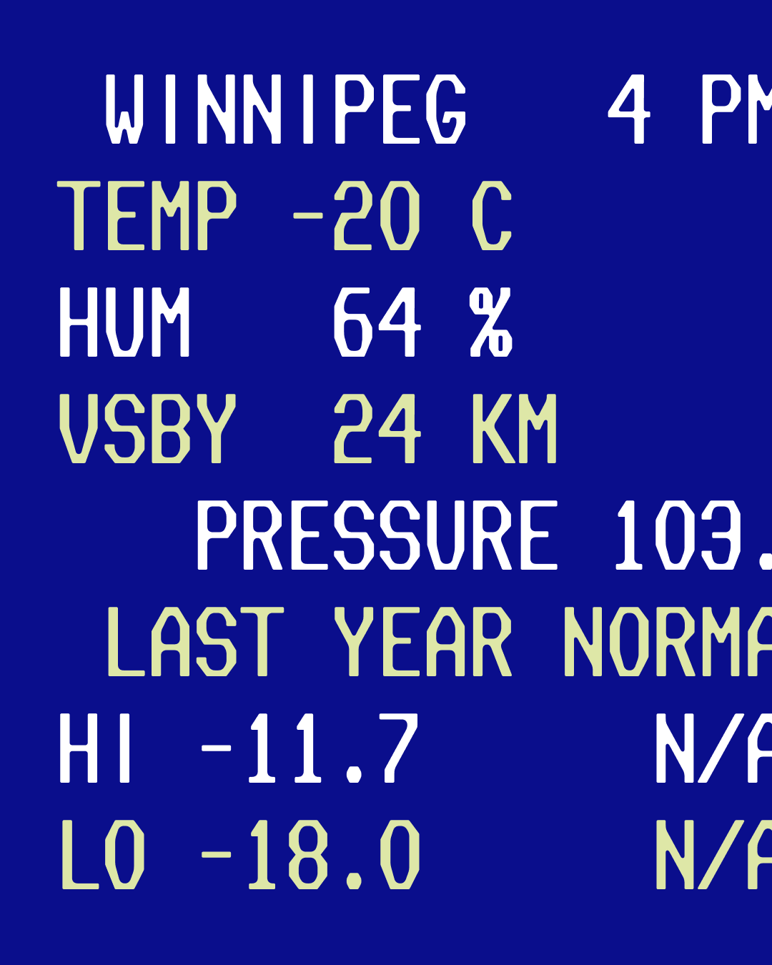
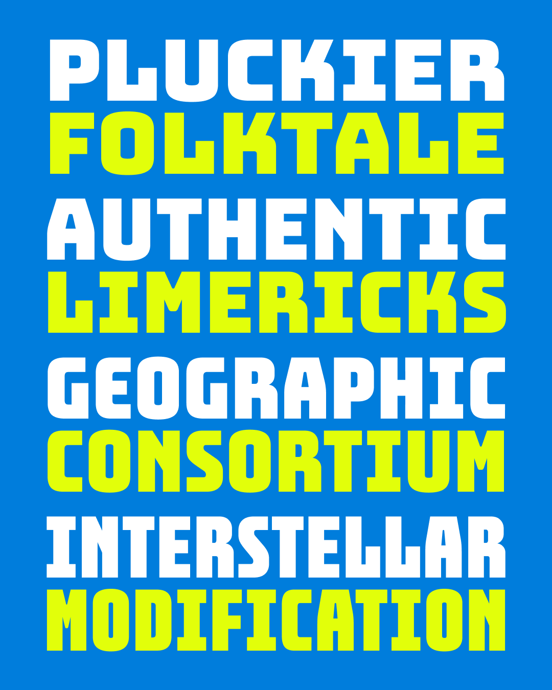
Nickel Stencils
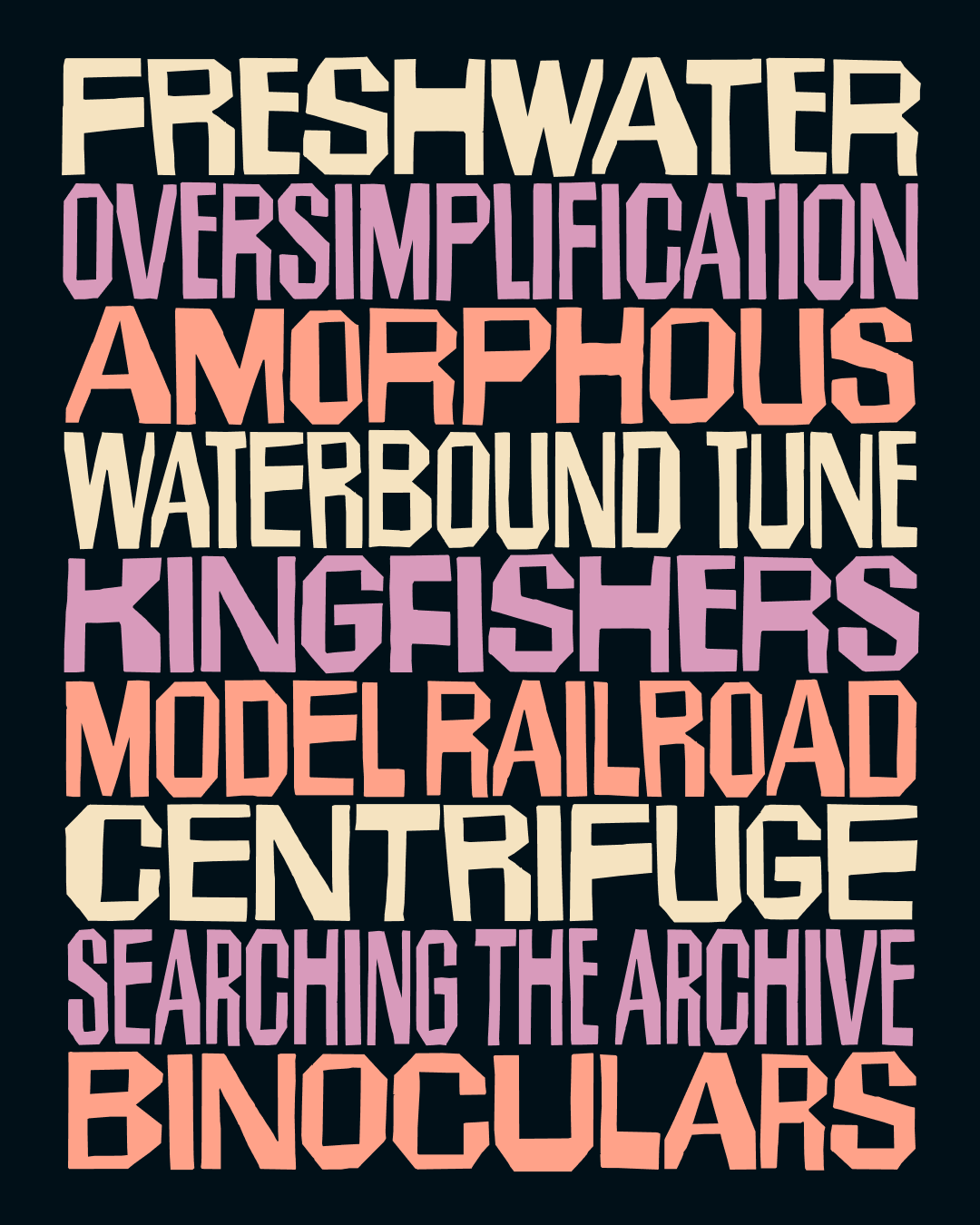
Indoor Kid
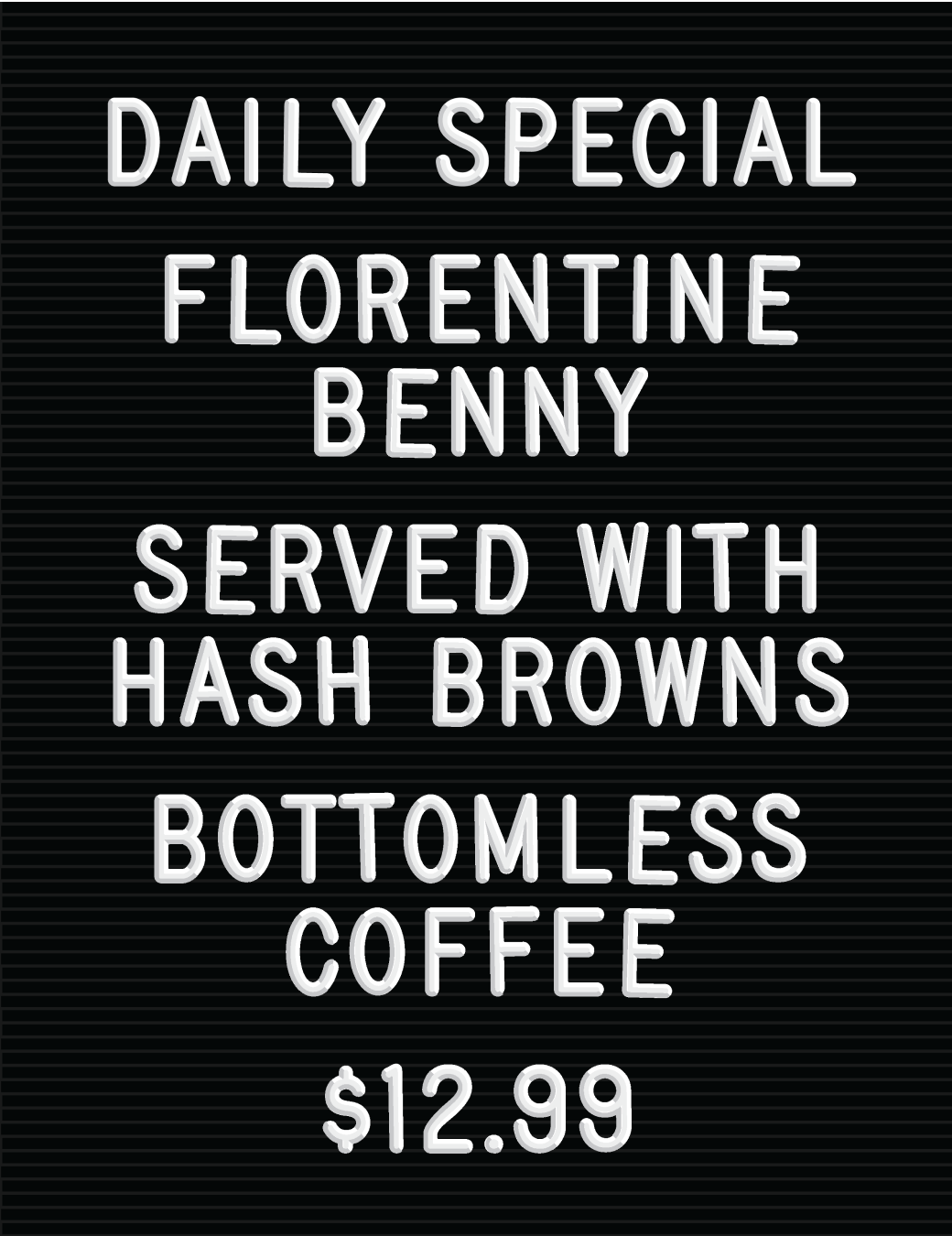
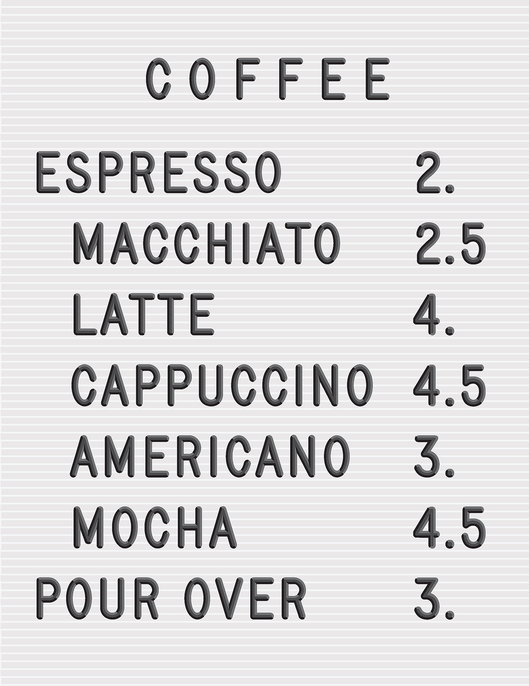
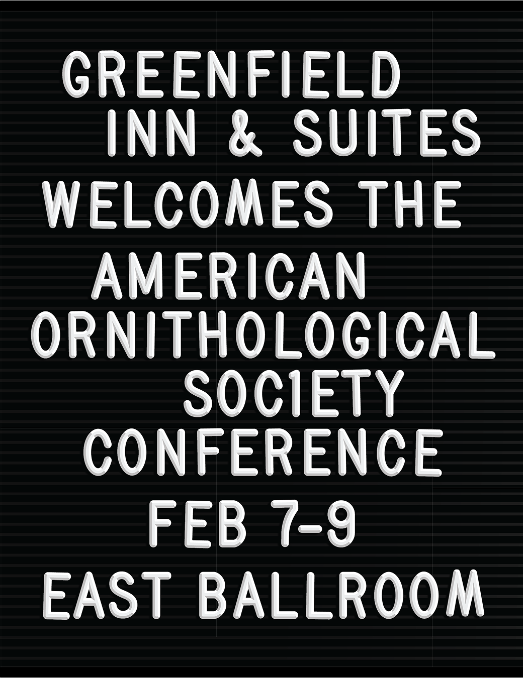
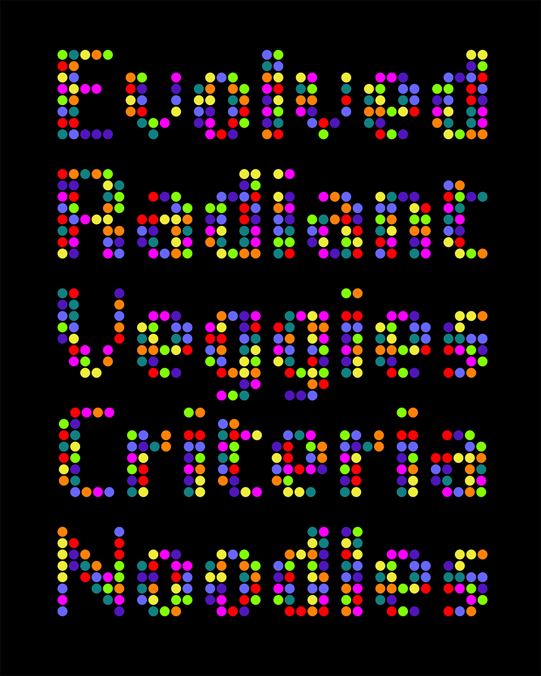
Daily Special
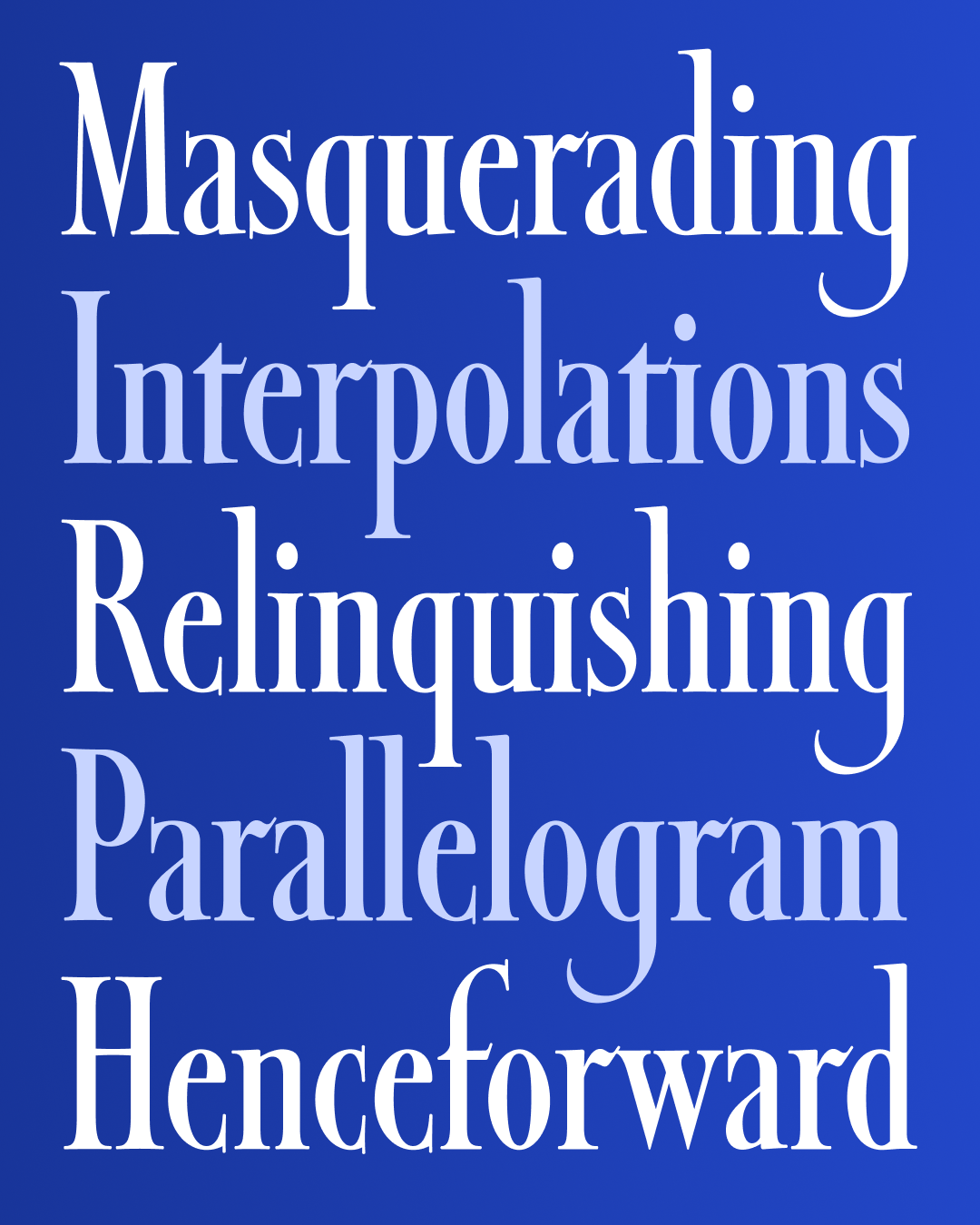
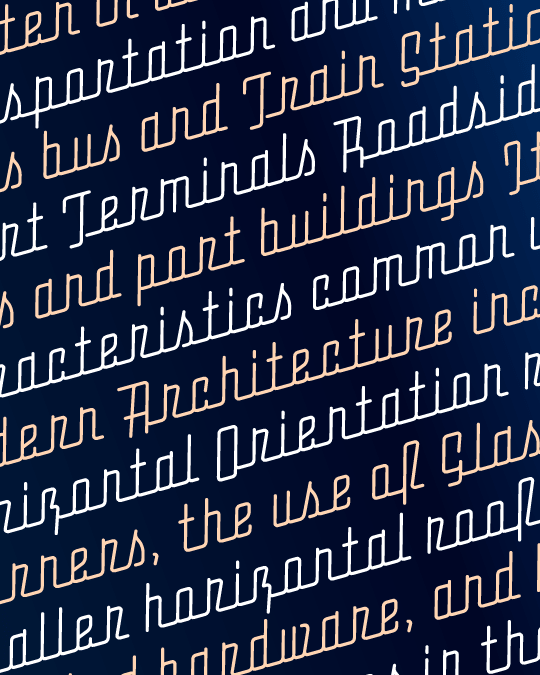
Map Roman Lowercase
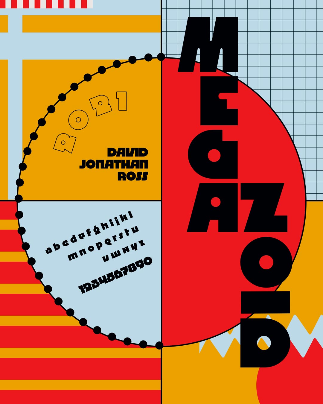
Megazoid Italic

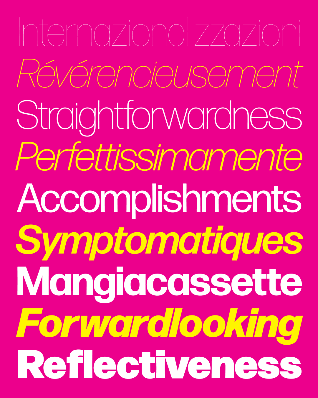
Input Cipher
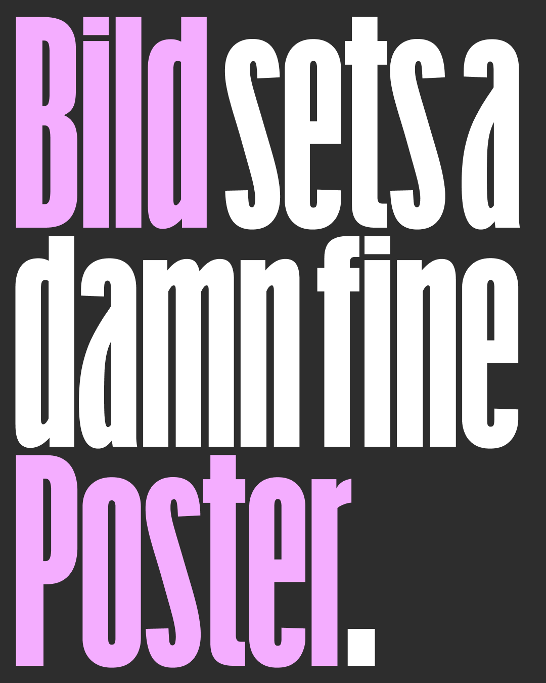
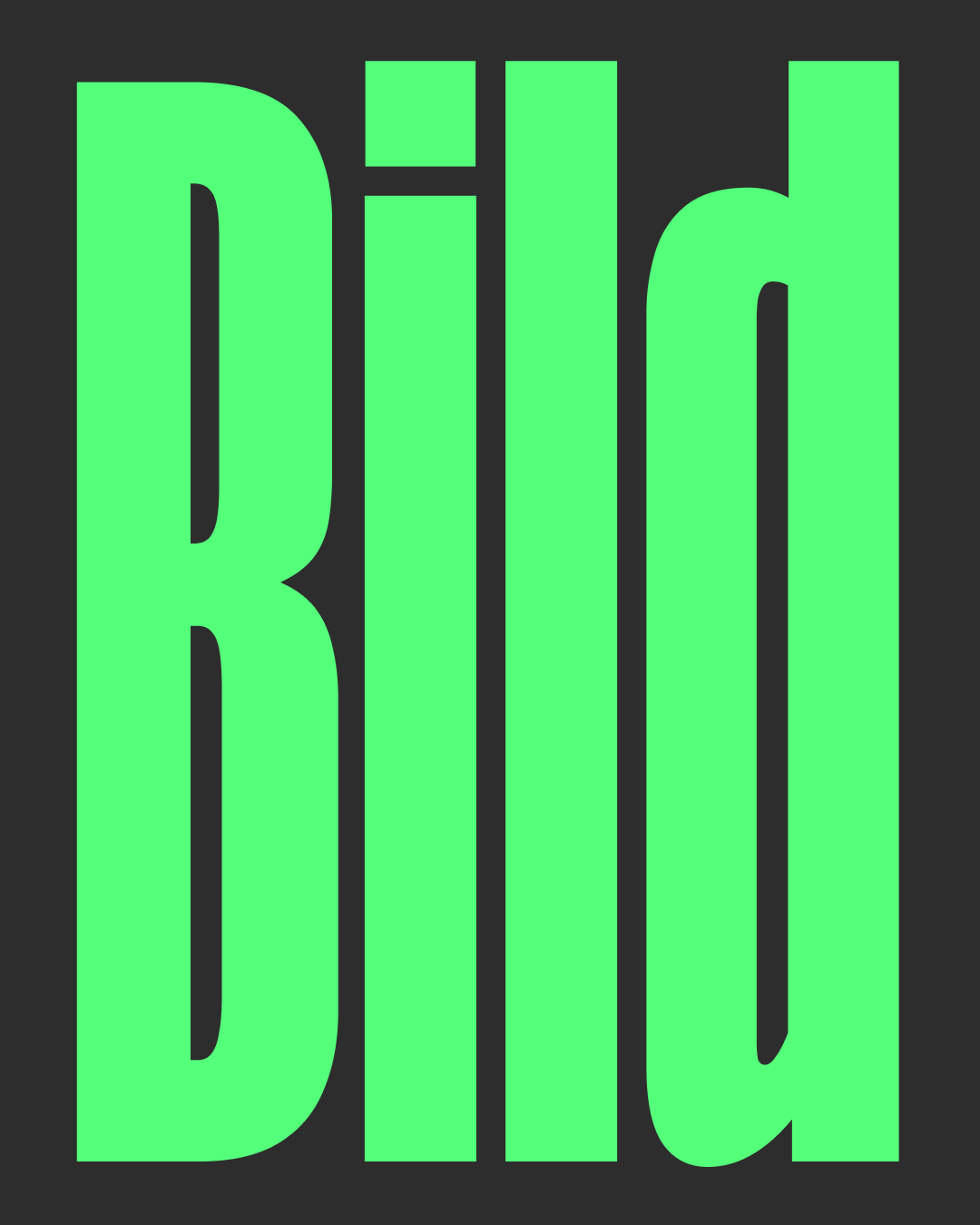
Bild Poster
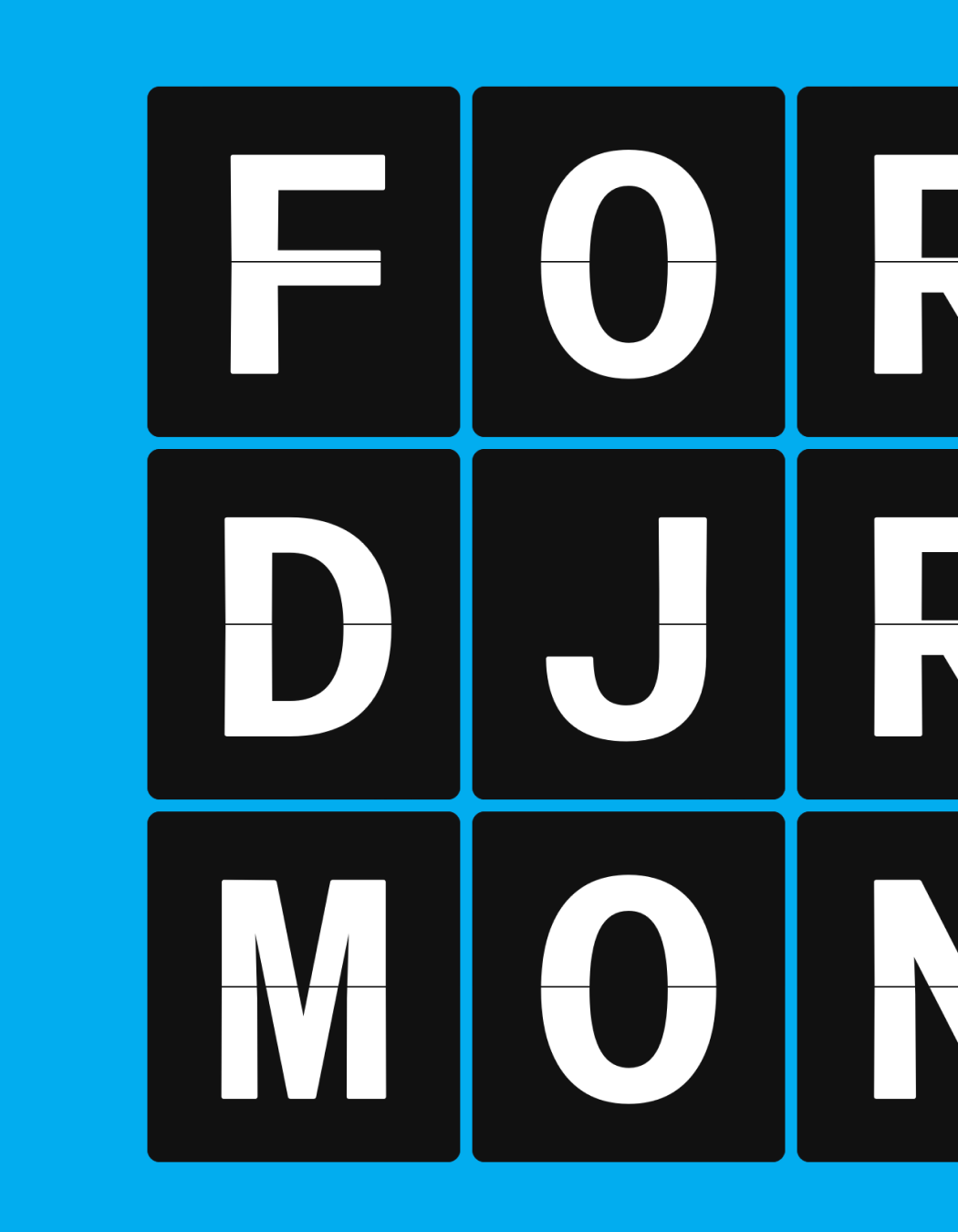
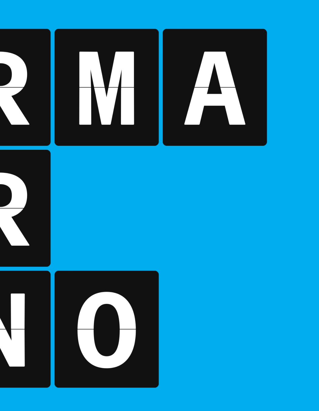
Lab DJR

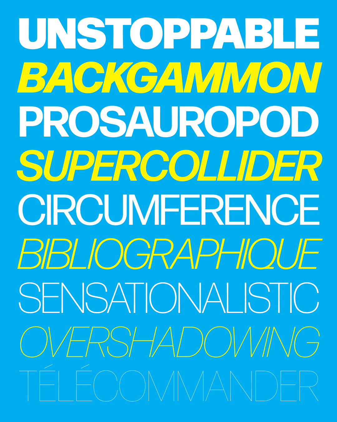
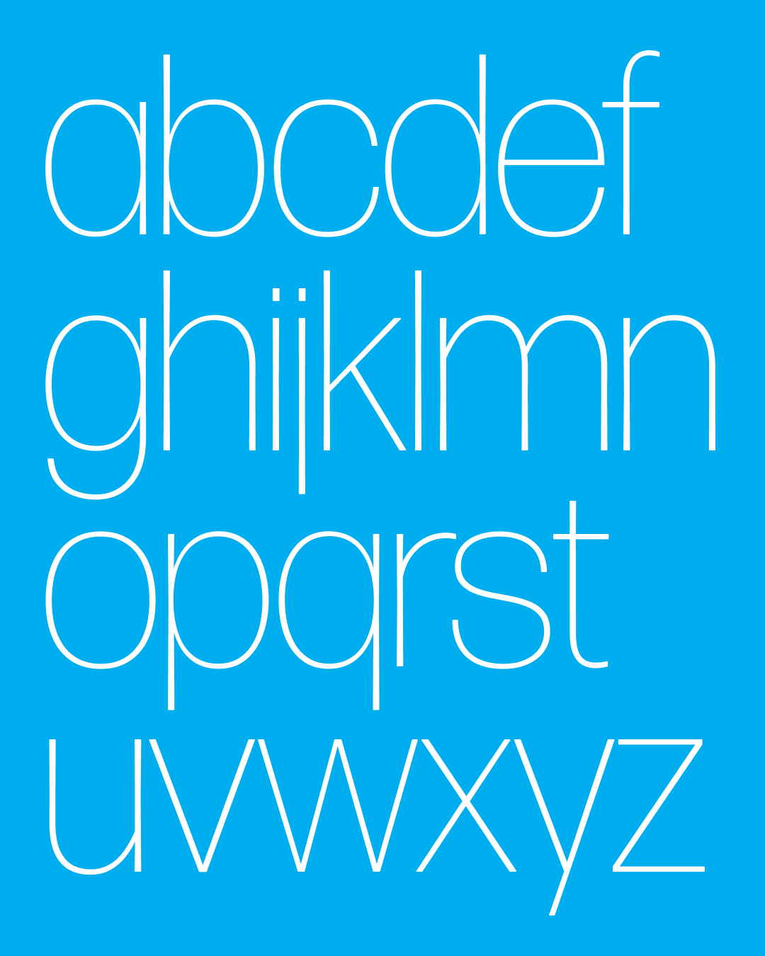
Megascope Thin

Megascope Bold
Glyptic DJR
Job Clarendon Compressed Hairlines
Klooster Thin U&lc
Pappardelle v2
Club Lithographer v2
Clavichord
Klooster Thin U&lc
Polliwog
Rustique
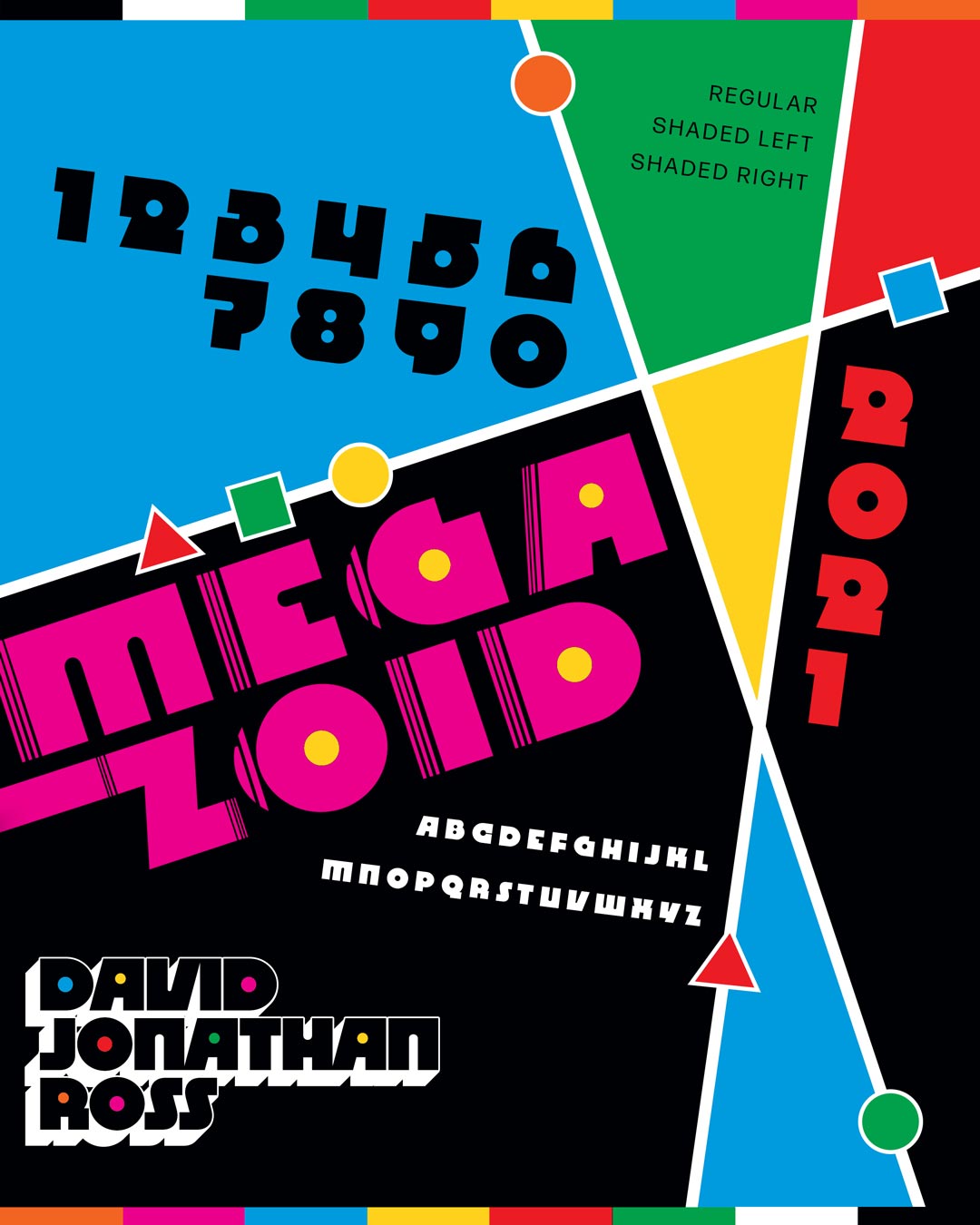
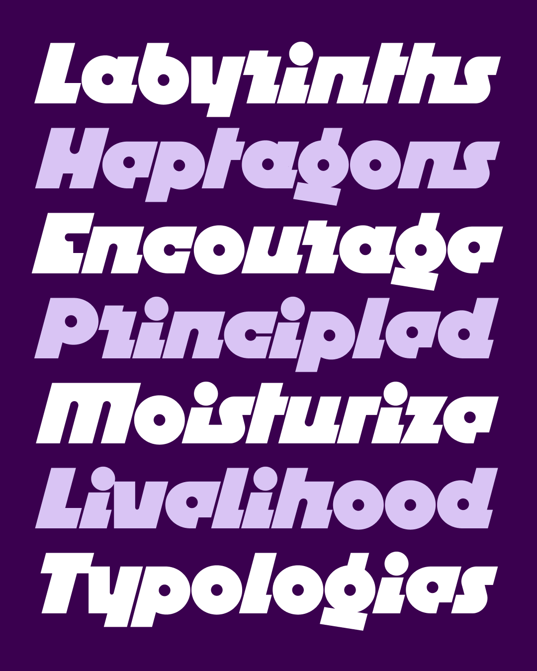
Megazoid

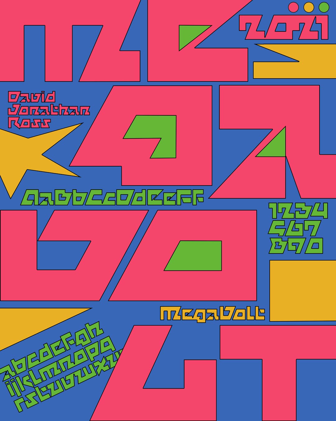
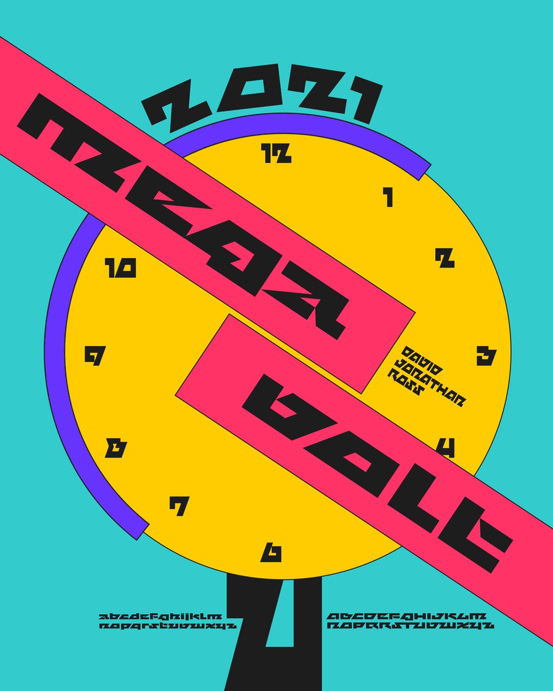
Megavolt
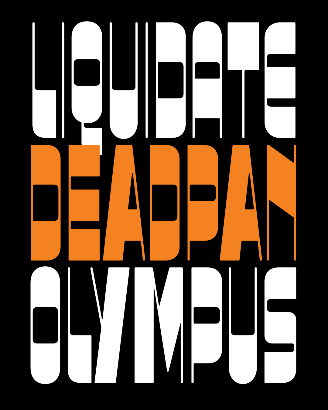
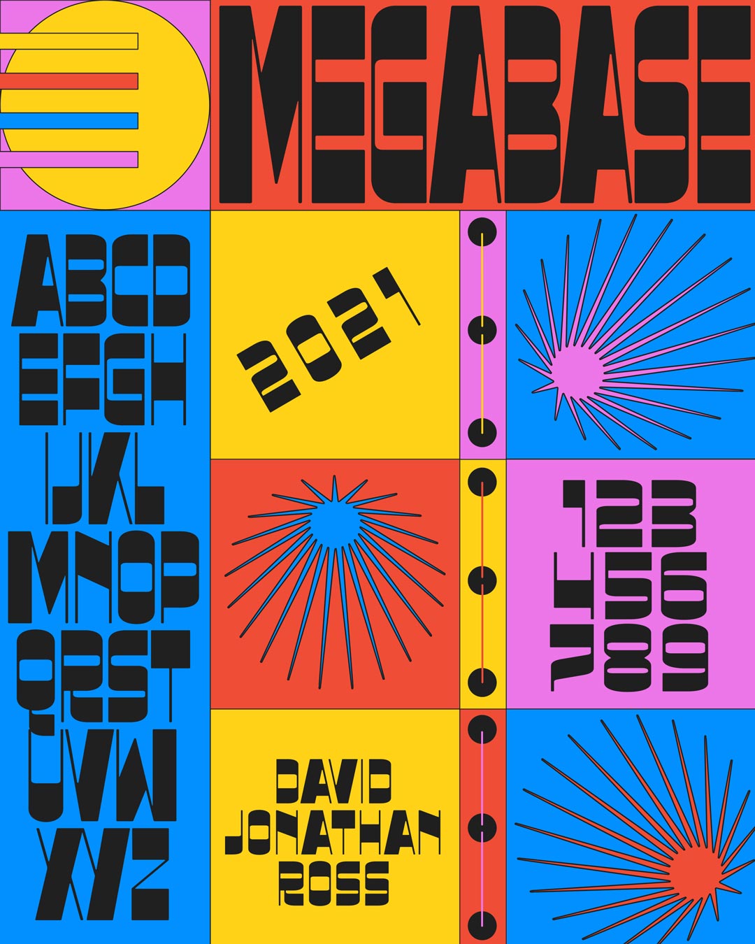
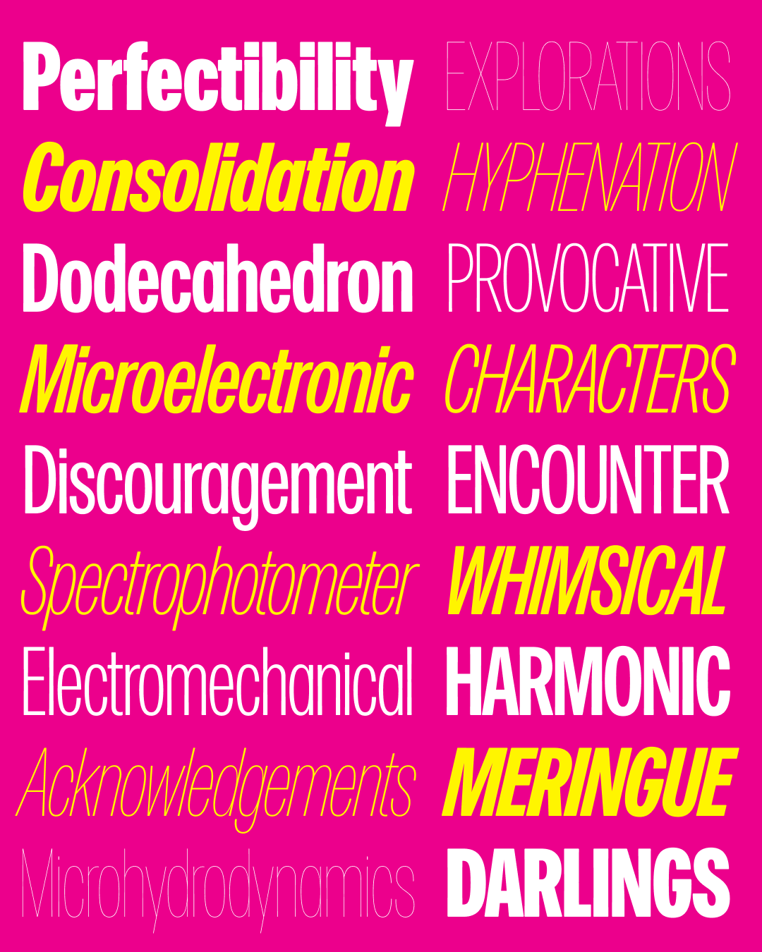
Megabase
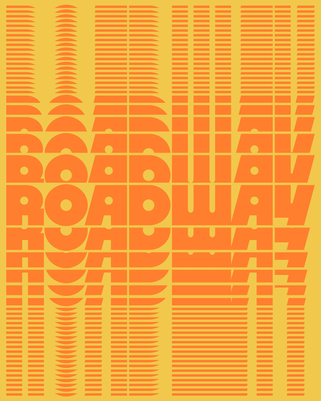
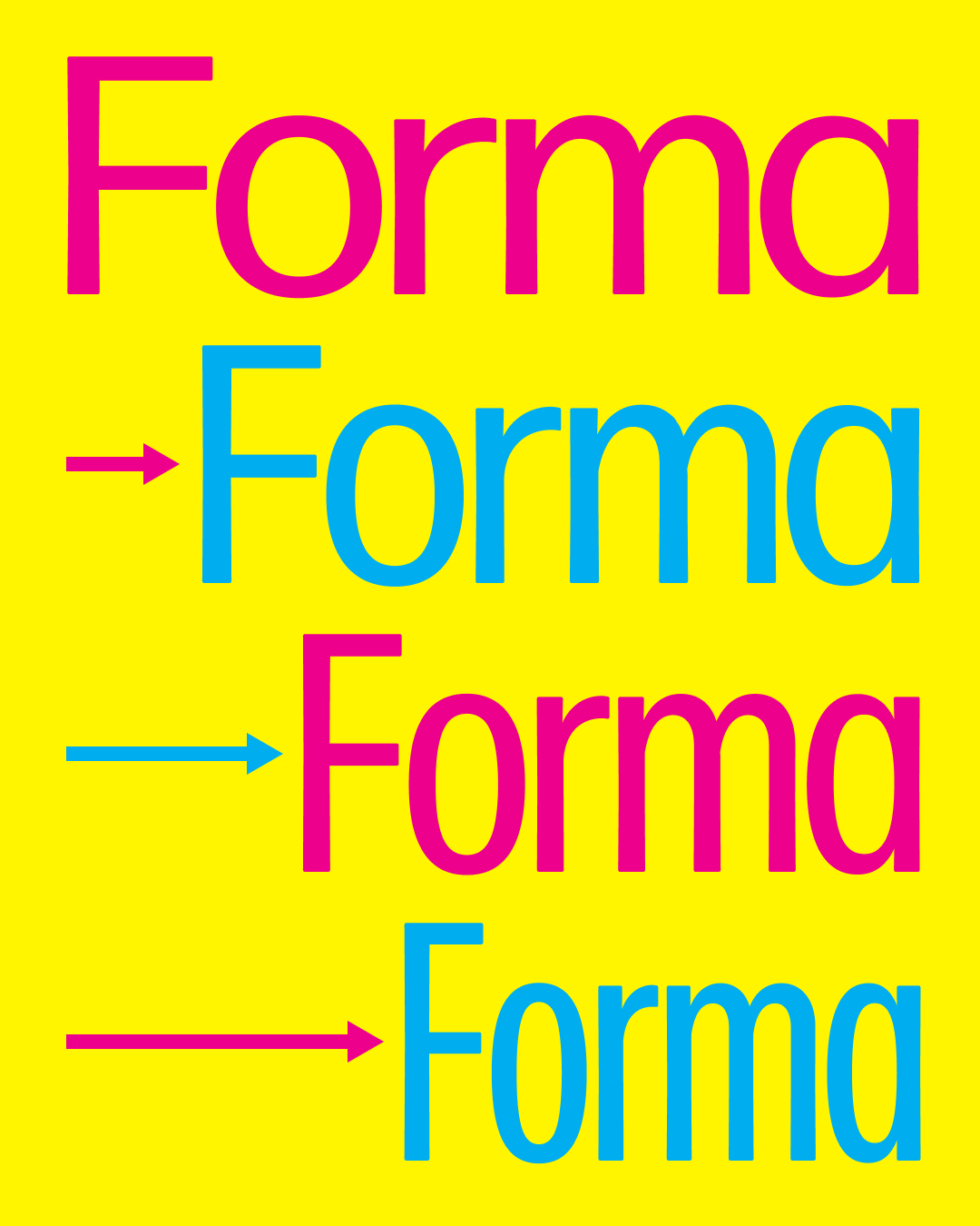
Extendomatic

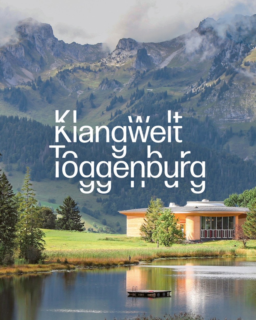
Klangwelt Toggenburg
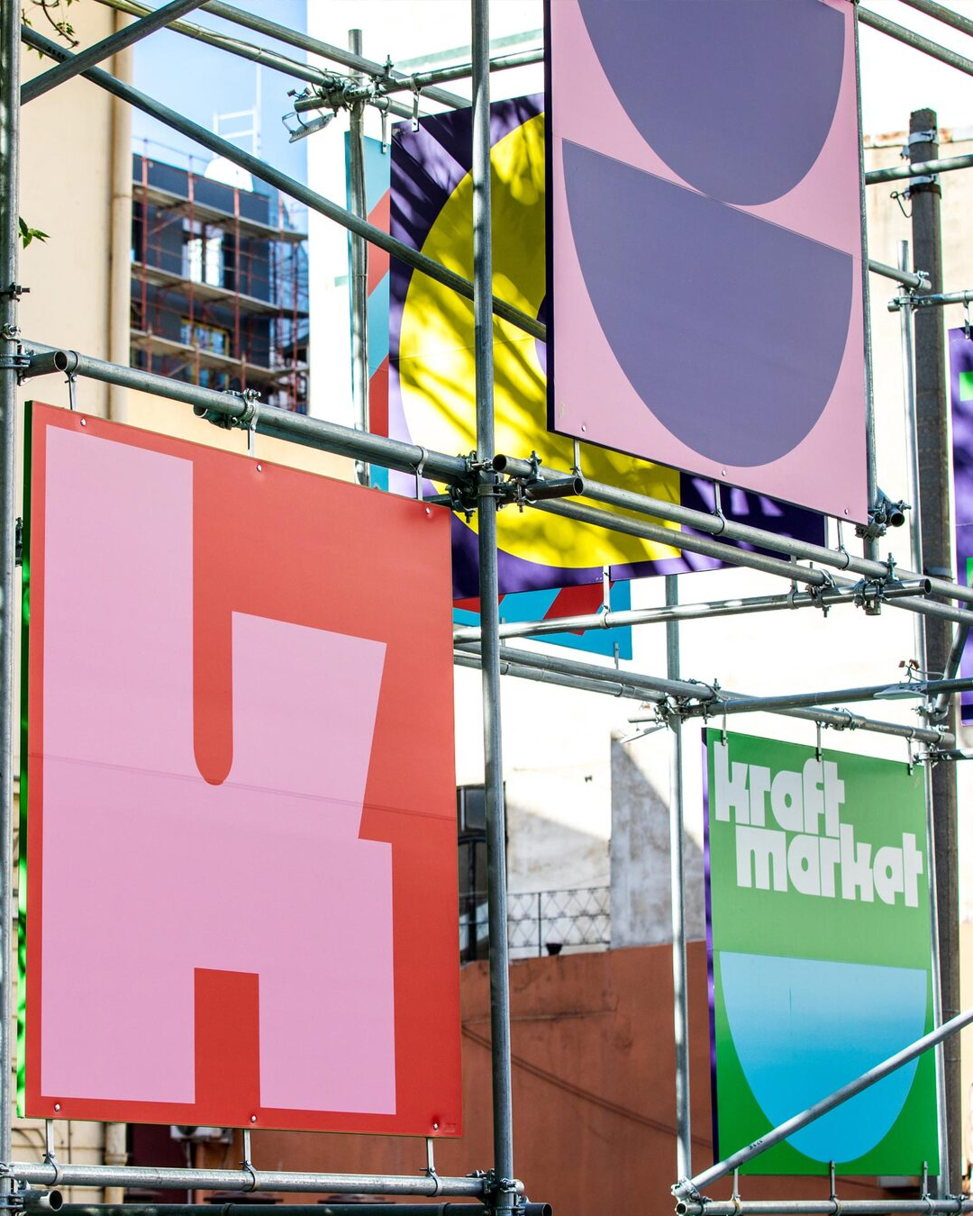
Kraft Market
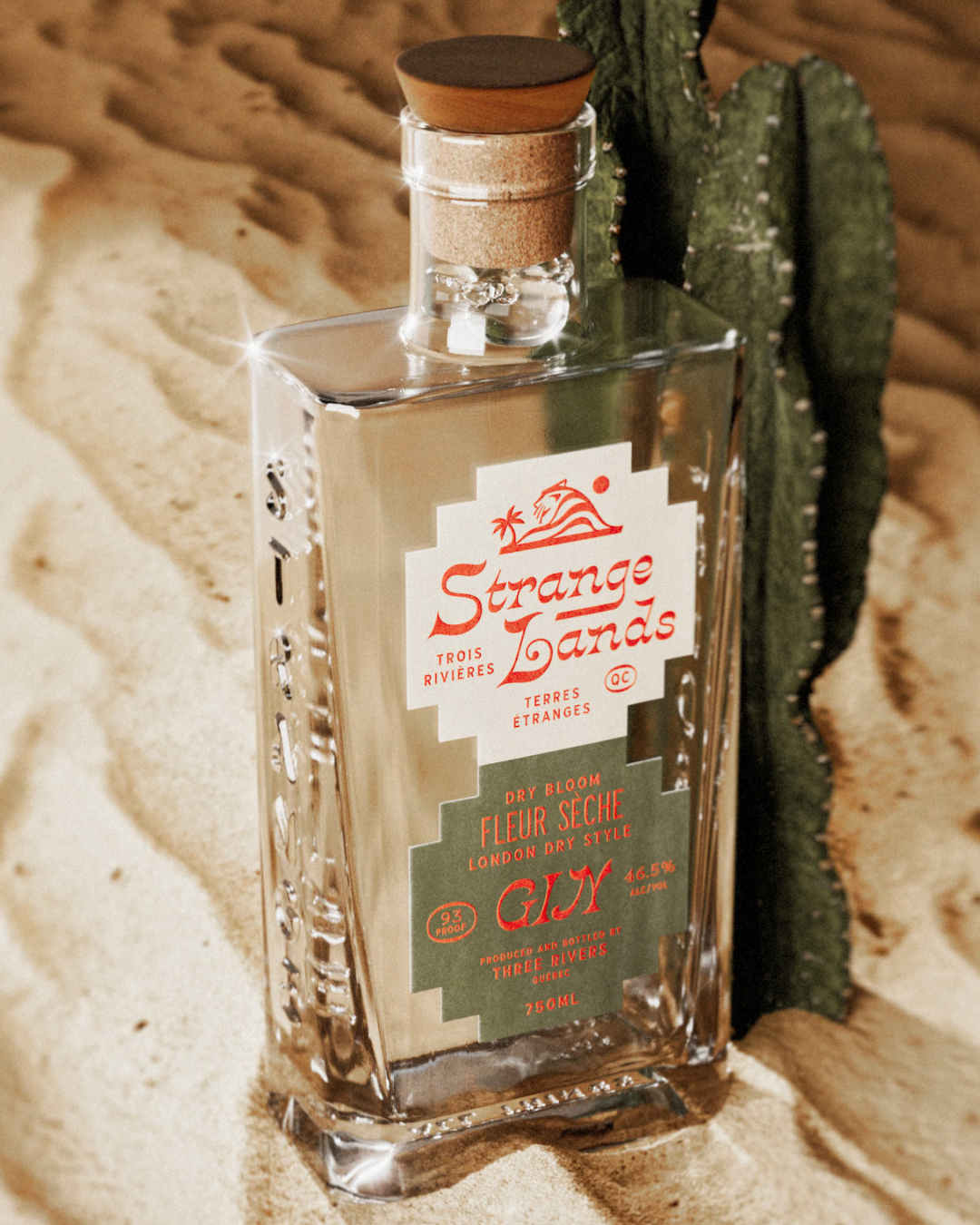
Strange Lands

Mike’s Maze

Club de Cine
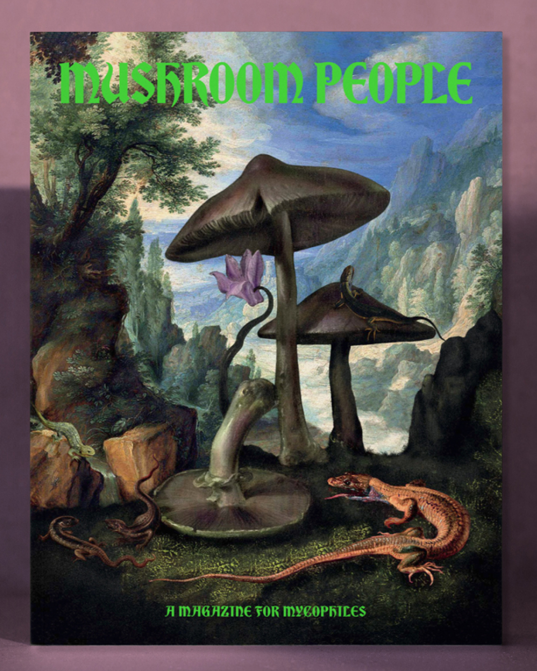
Mushroom People
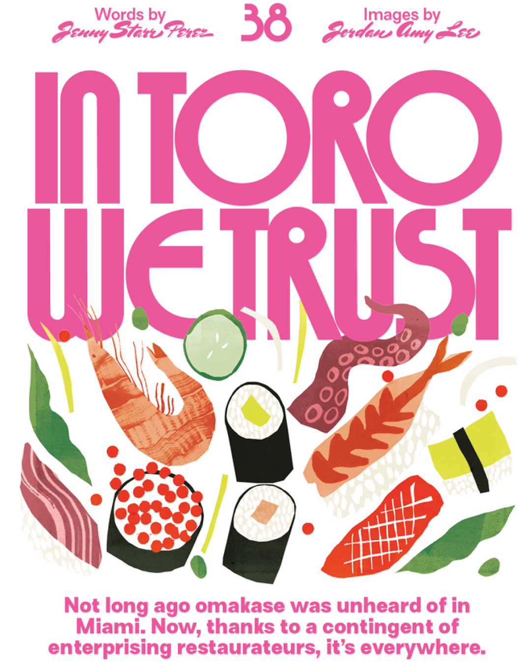
Secret Menu
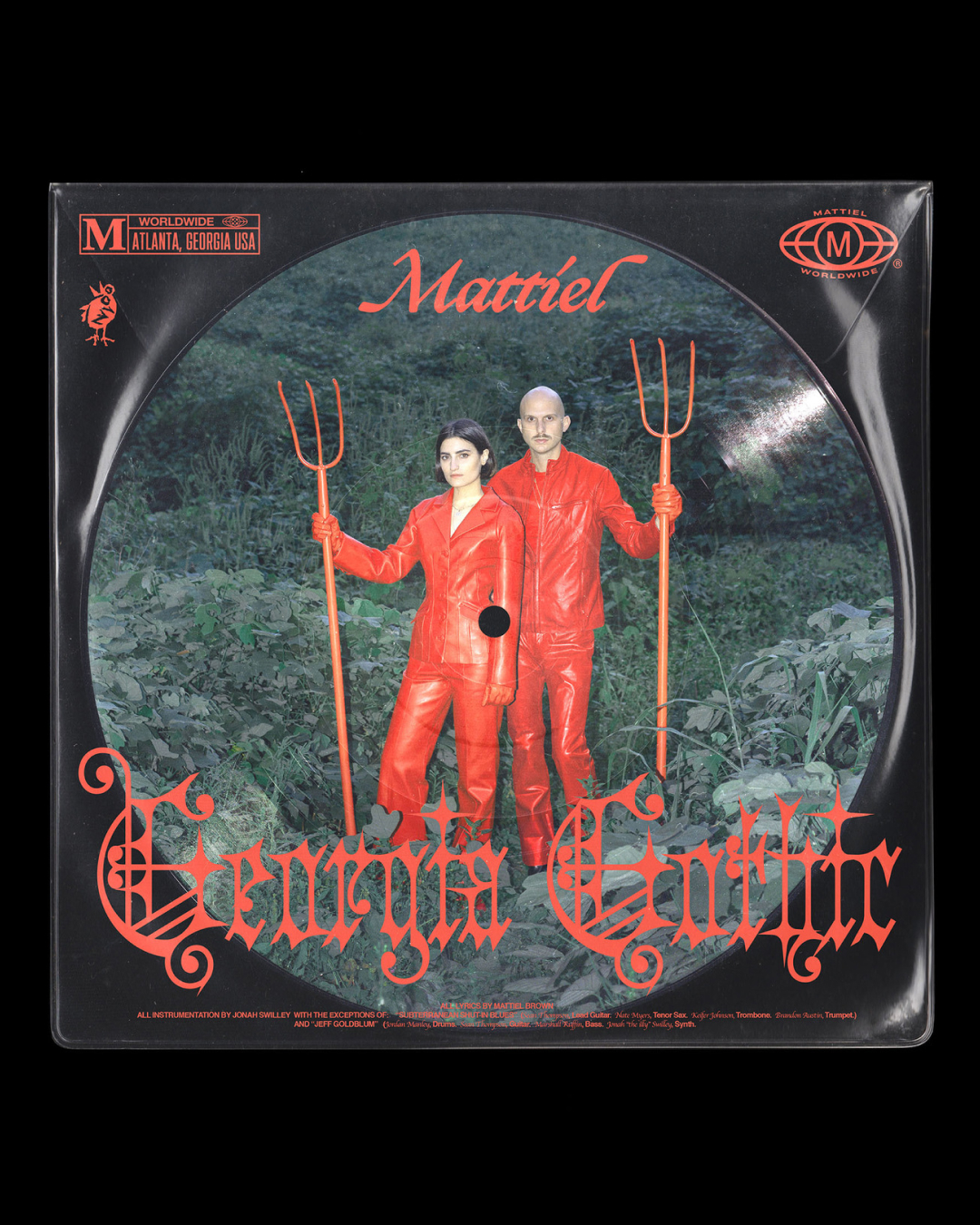
Georgia Gothic

Severance


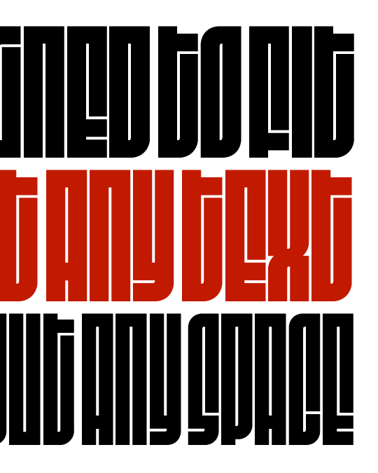
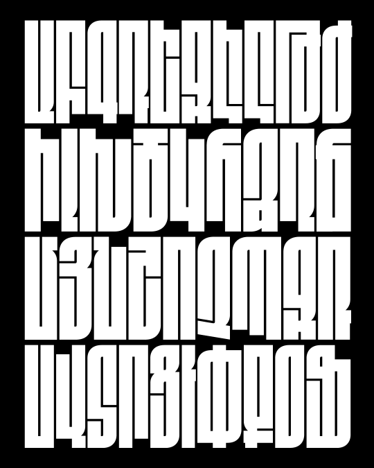
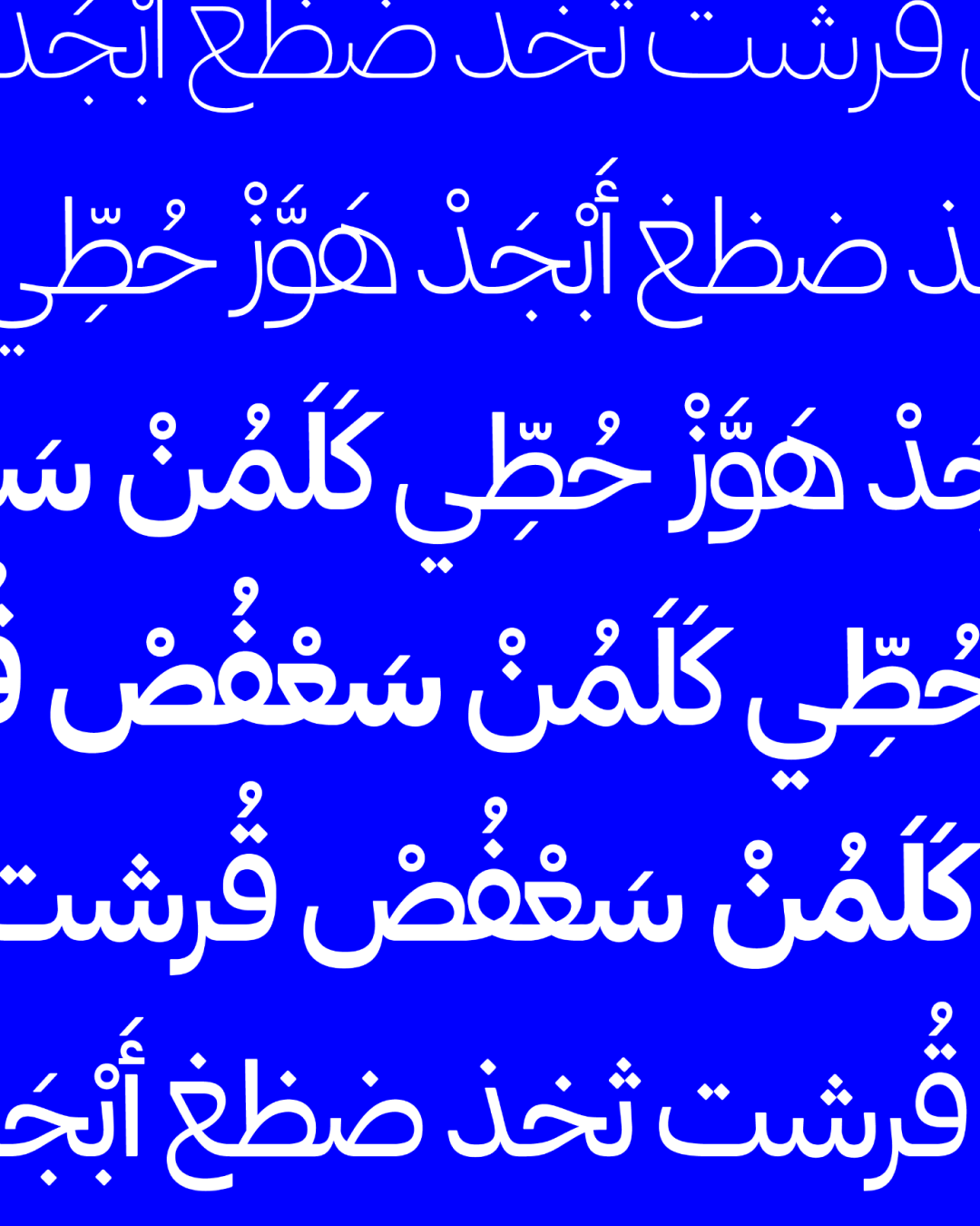
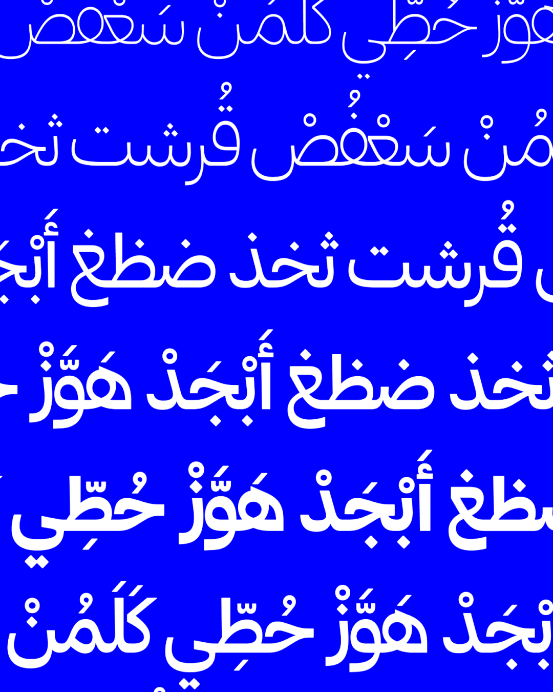
Fit Armenian, by Gor Jihanian
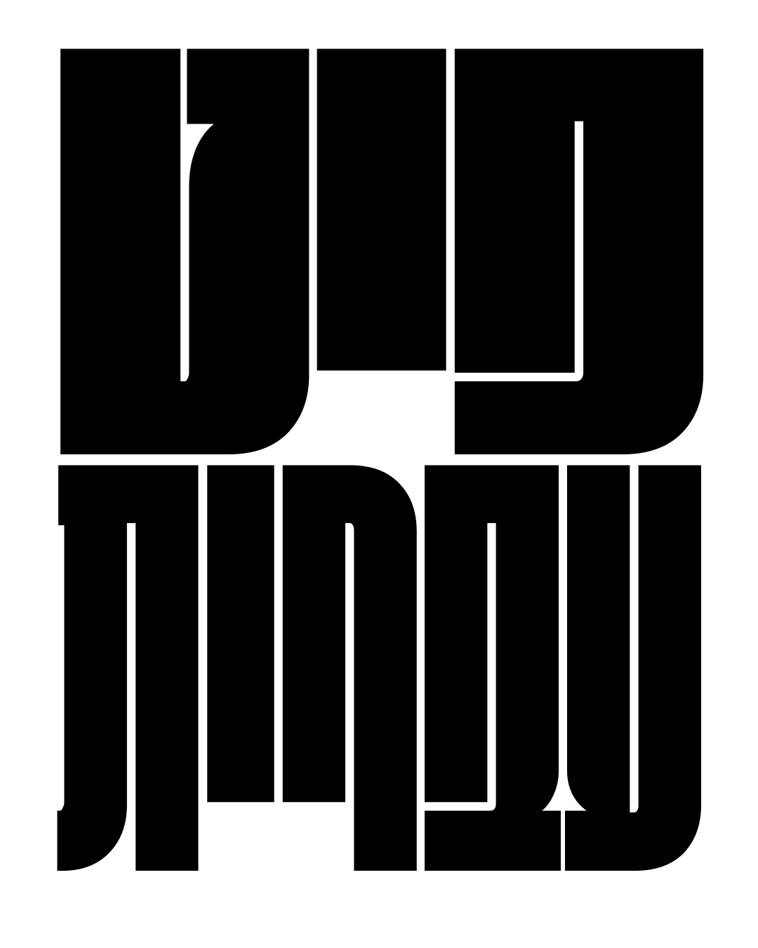
Fit Hebrew, by Oded Ezer
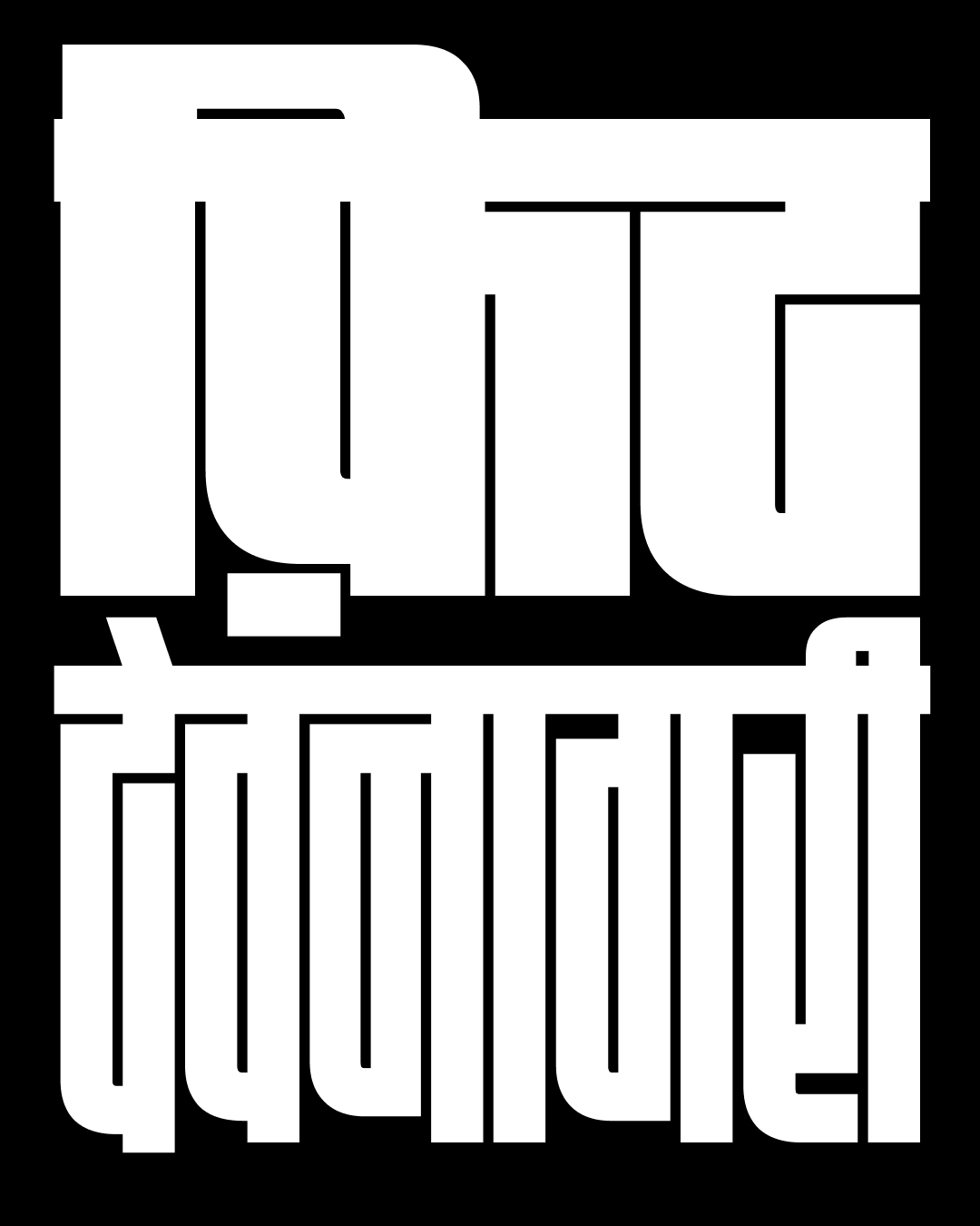
Fit Devanagari, by Kimya Gandhi