So, today marks 10 years since I launched my type foundry, which coincided with the release of my font Gimlet.
I’m not great commemorating things like this (or introspection about my process in general 😅), but it did feel worth mentioning. It’s difficult to overstate how grateful I am to the folks at Font Bureau who encouraged and supported me as I took the leap back in 2016, and to the customers, club members, friends, mentors, and font lovers who have made it possible for me to make the fonts that I want to make ever since.
Most of my early fonts were “synthesis fonts” that blended different influences within a genre, but Gimlet was my first type design to be in direct conversation with a single source: Georg Trump’s Schadow.
Nick Sherman was the person who first urged me to tackle Schadow, and he and Indra Kupferschmid acted as my guides as I unpacked the multifaceted design and reimagined it as a contemporary quirkhorse.
While display type has trended towards “more attitude” over the past 10 years, I feel like text typography has actually moved in the opposite direction.
Gimlet makes the argument for a judicious helping of attitude across the board, from text to display. It’s something I’d love to see more of in contemporary type palettes.
Gimlet is not one of my most-used text faces, but it remains one of the families I am most proud of.
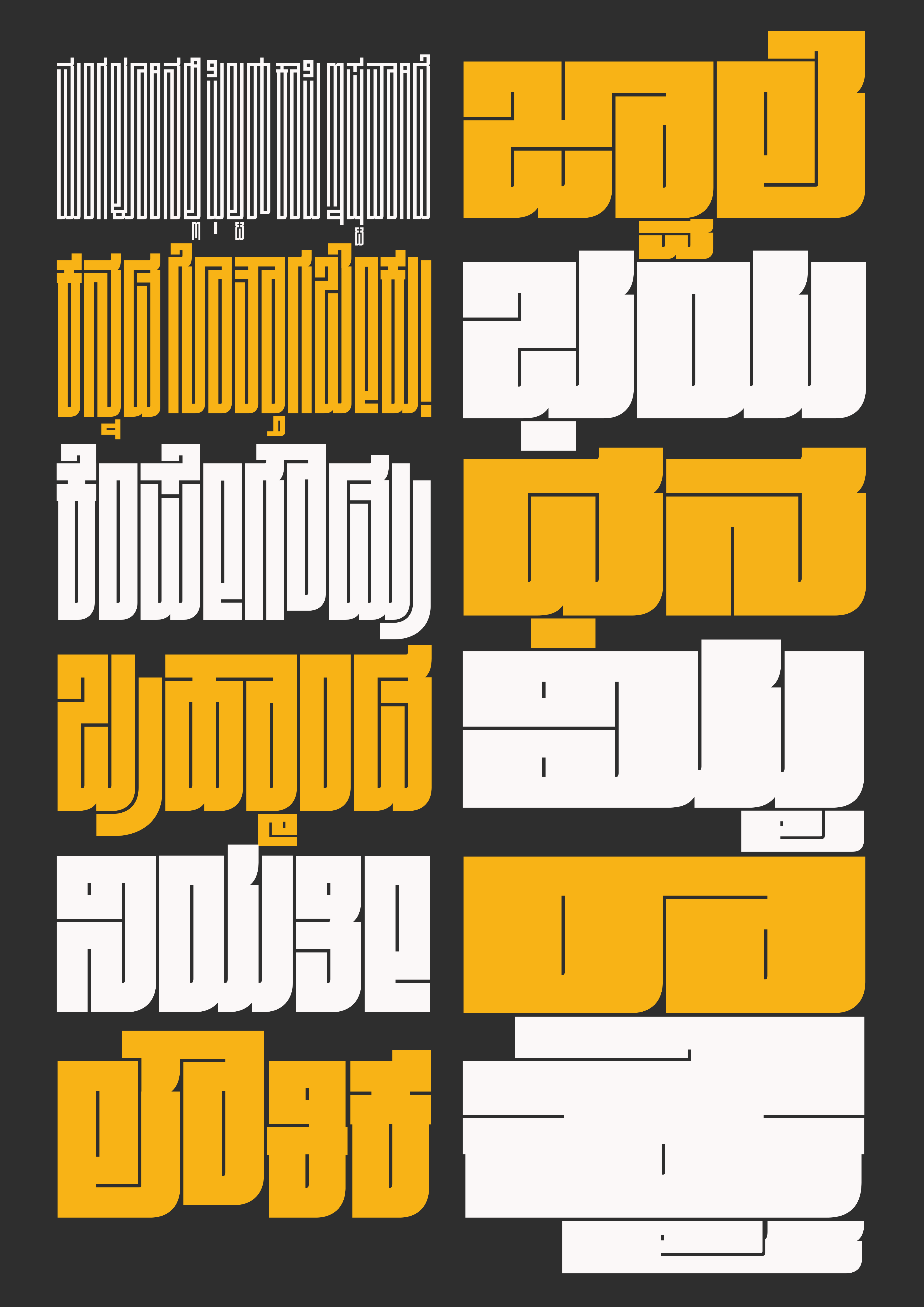
I am not a speaker of Kannada or a reader of the Kannada script, but it doesn’t take an expert to see that the writing system usually involves a lot of curved forms. In Fit, blockiness is king—so when Taresh proposed Fit Kannada to me in 2024, I wasn’t sure that it would be a good, ahem, fit.
But boy am I glad I listened to Taresh—he took this project and ran with it, producing an intricate and mesmerizing design that manages to stay true to both the original typeface and the script. He describes it best: “While [Fit] may be bold and loud, it blends into the typographical landscape of Kannada with its attention to legibility, locally relevant letterforms, and carefully crafted conjunct forms.”
Fit Kannada interprets the script’s complex conjuncts and vowel-sign formations through the modular squeeze of Fit’s visual grammar. But Taresh also took the liberty to expand that grammar to meet the needs of the script when he needed to. Kannada’s “ottu” (small conjunct) forms required drawing these modules at an entirely different scale, with advanced OpenType features that help them cascade gracefully.
Fit Kannada has already been awarded by the Type Directors Club in their TDC72 competition. And I am so happy to see that it is now out in the world!
I haven’t been on top of my game this month. I know I had mentioned the italics I was working on for Lithographer Text, but I couldn’t bring myself to go through the focus-demanding, detail-oriented work of finishing them. I will send those fonts to you someday, but today is not that day.
Instead, I desperately needed a reset. I wanted to start something new, where I could lower the stakes, move fast, and have fun. And what I ended up with is a fifth entry in my Megafonts series: Megawarp!
Each of the Megafonts engages with an element of sans serif typography that has been embraced by the science fiction genre—for Megabase it was horizontal stress; for Megavolt, angularity; Megazoid, blockiness; and most recently Megascope, geometry and proportion.
This time, I’ve gone all-in on another key ingredient of the sci-fi milieu: fragmentation. In Typeset in the Future, Dave Addey’s rules of futuristic typography include instructions to “remove an entirely pointless and arbitrary segment of the text”, such as “a horizontal line from the majority of the word.” This technique is perhaps most famously used in Blade Runner’s poster art, where a line of negative space shoots like a laser beam through the upper portion of each letter. (See also Comicraft’s fun interpretation, Running with Scissors.)
If the laser beam technique can feel a little arbitrary in how it breaks letters apart, I became interested in how these slices could be integrated into a typeface more intentionally. Aldo Novarese’s Stop (recently expanded by the great Dan Rhatigan) demonstrates how letters can be broken down to the bare minimum of what is needed for communication, a concept that was further explored in other geometric stencil faces like Orientation and Svang.
I also spent some time checking out the post-Microgramma squarishness of fonts like Earth and Corporate Image, which employ their slices opportunistically to add distinctiveness and style. I especially love how these fonts open themselves up to the interplay of uppercase and lowercase forms, something I tried to build into Megawarp’s unicase. Using stylistic sets, you can adjust the dial from standard all-caps to a futuristic uncial of sorts:
I started Megawarp using the laser beam approach, but I quickly found myself deviating from it. I developed a loose set of rules to how I would apply slices, which are as follows:
A slice can’t be arbitrary—it has to happen at some “event” in the letterform, like a stroke ending or intersection.
A letter must get sliced somewhere unless that slice will make it indistinguishable from another letter.
If it’s possible to slice a letter in the upper left quadrant, do it. If not, slice it in the lower left quadrant. Strokes on the right side of the letter generally don’t get a slice unless they need one.
There’s not much more to it! The structure of the letterform influences the location of the slice, and the location of the slice influences the structure of the letterform.
The design is so modular and cut-and-pastey that it was easy for me to iterate on it, try out four or five versions of a letter and see what worked best. (I left a lot of these extra glyphs in the font as alternates…I should probably pare them down eventually.)
When you look at a negative shape in Megawarp, you can never really be sure if you’re looking at a slice or a counterform. Take the default capital A above, for example. Do you see it as a typical capital A with a slice in the upper left? Or do you see it as a lowercase a, with the bottom stroke missing?
This ambiguity led me to some unexpected solutions. On its face, the lowercase e zig-zags like a z, and the three-pronged a looks like a bizarre, stylized numeral 3. If you dig, you’ll find an alternate S that looks more like a backwards C.
These characters are a bit difficult to decipher on their own, but I think they start to work in context—it’s almost as if the more conventional letters help you acclimate to the less conventional ones in real time. (I confess, I still wonder if the default a is a bridge too far, and I might consider swapping it out for a more conventional form in the future. But I figured I should go with my gut at first and pull back later if necessary!)
All of this is to say, this font is meant to be played with. The font has loads of alternates, a huge x-height, and I drew the uppercase and lowercase with the same spacing and vertical stem weights so that you can mix them together as you see fit. (The lowercase i is literally the uppercase I with a slice through it.)
And it might be a bit on the nose with the whole sci-fi theme, but I couldn’t resist including Oblique and Backslanted styles. Feel free to add outlines and drop shades to your heart’s content!
This font is a perfect example of why, nine years in, I think it is still worthwhile to make monthly fonts for you. I was treading water all month, unable to make progress on anything, but the approaching deadline forced me to toss my plans out the window and just make something. And once I got some momentum going, things really started to flow.
Is it the most original thing in the world? Probably not. But I think there are a few inspired moments in there, and I certainly hope that you have as much fun with this one as I did. Warp speed ahead!
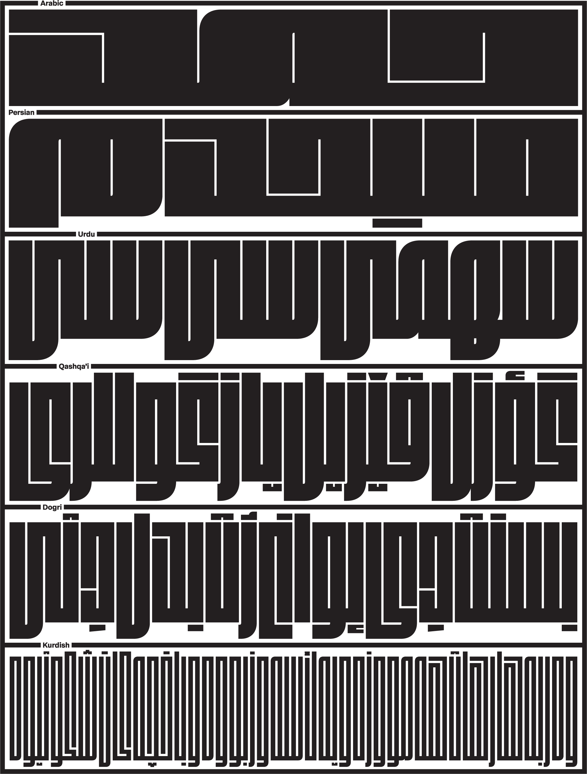
Fit is a typeface that is primarily focused on filling space, a quality it shares with the Square Kufi style of Arabic calligraphy. In her interpretation, Sahar was able to build on this rich calligraphic tradition, without being constrained by it. The result is an inventive and modern take on the Arabic script that deftly employs Fit’s design language of curves and divets to make the bold, brash letterforms extra flavorful (and hopefully extra legible, too).
So…I know I said I was going to send you more Lithographer Text this month, but the universe had other plans. (In other words, I boneheadedly overwrote a bunch of my work on it earlier this week, without backing it up.)
I debated sending you what I do have, but it’s just not quite ready for primetime. I always struggle with how “beta” club releases should be. My goal is to send you a slightly doughy cookie each month—something underbaked enough to be nice and chewy, but not so much that you end up with food poisoning.
So while Lithographer Text sits in the oven for a little longer, I’m sending you a little something that has been in the slow-cooker since 2010. This is Baby Condor: a cut of my sparkly, contrasty typeface Condor that is, well, less sparkly and contrasty.
It’s always easy to complain about “blanding” and the ubiquity of corporate sans serifs (and believe me I do!). But I certainly understand the appeal of a one-size-fits-all typeface that works as well on a smartwatch as it does on a billboard.
I would love for a stylized design like Condor to be a viable alternative to these branding sans serifs, but I know it is not. Condor is a really finicky design, especially when it comes to size. If you set it just a bit too small, it gets tough on the eyes very quickly. A separate small-size version is the only way for a family like that to even try to compete.
I first imagined a small-size version of Condor shortly after its release in 2010, and I drew it following the approach taken by Font Bureau’s Reading Edge Series. In addition to the lower contrast, it also has a bigger x-height and looser spacing. Its weights, particularly the difference between Regular and Bold, are tuned for harmonious paragraphs instead of punchy headlines.
Even though it follows the small-optical-size playbook, I still think of Baby Condor as a text-ified display font, rather than a true text font (if that makes any sense). I’m not hoping to read any books set in Baby Condor, but I can see it doing a lot that the original Condor could not.
For example, the Canadian Space Agency also uses Condor for supporting text in a lot of their videos, and have wisely tracked it out when it gets on the small side. My hope is that Baby Condor will offer a more robust alternative to Condor in situations like these, while still preserving plenty of the family’s distinctive flavor.


.png)